Design System
A design system manages scalable design, improves web page consistency, and streamlines future projects through reusable components.
Project Overview
In this project, I led the development of a comprehensive design system for our client’s brand, streamlining the design process, and ensuring consistency across all platforms. By creating reusable UI components and establishing clear guidelines, I enabled our team to work more efficiently while maintaining a visual identity. The design system now serves as a foundation for future projects, enhancing scalability and collaboration.
In this project, I led the development of a comprehensive design system for our client’s brand, streamlining the design process, and ensuring consistency across all platforms. By creating reusable UI components and establishing clear guidelines, I enabled our team to work more efficiently while maintaining a visual identity. The design system now serves as a foundation for future projects, enhancing scalability and collaboration.
Goal
Analysis
Competitor Research
Recreation
Components
Variables
Styles
Grid System
Foundation
Description
As an individual designer, I only had a limited amount of time to develop a design system due to other UX/UI projects requiring my attention. To build my first complete system and structure my project files, I researched brands like Chakra UI, Shopify, Apple, and more.
As an individual designer, I only had a limited amount of time to develop a design system due to other UX/UI projects requiring my attention. To build my first complete system and structure my project files, I researched brands like Chakra UI, Shopify, Apple, and more.
Build a solid foundation
Recreate old components
Develop new variables / styles
Keep updating library as needed
Reuse the design system for each new project
The design system has to be flexible and scalable
Complete foundation
Updating the system must be easy and clear
Build a solid foundation
Recreate old components
Develop new variables / styles
Keep updating library as needed
Reuse the design system for each new project
The design system has to be flexible and scalable
Complete foundation
Updating the system must be easy and clear
Laying the Foundation
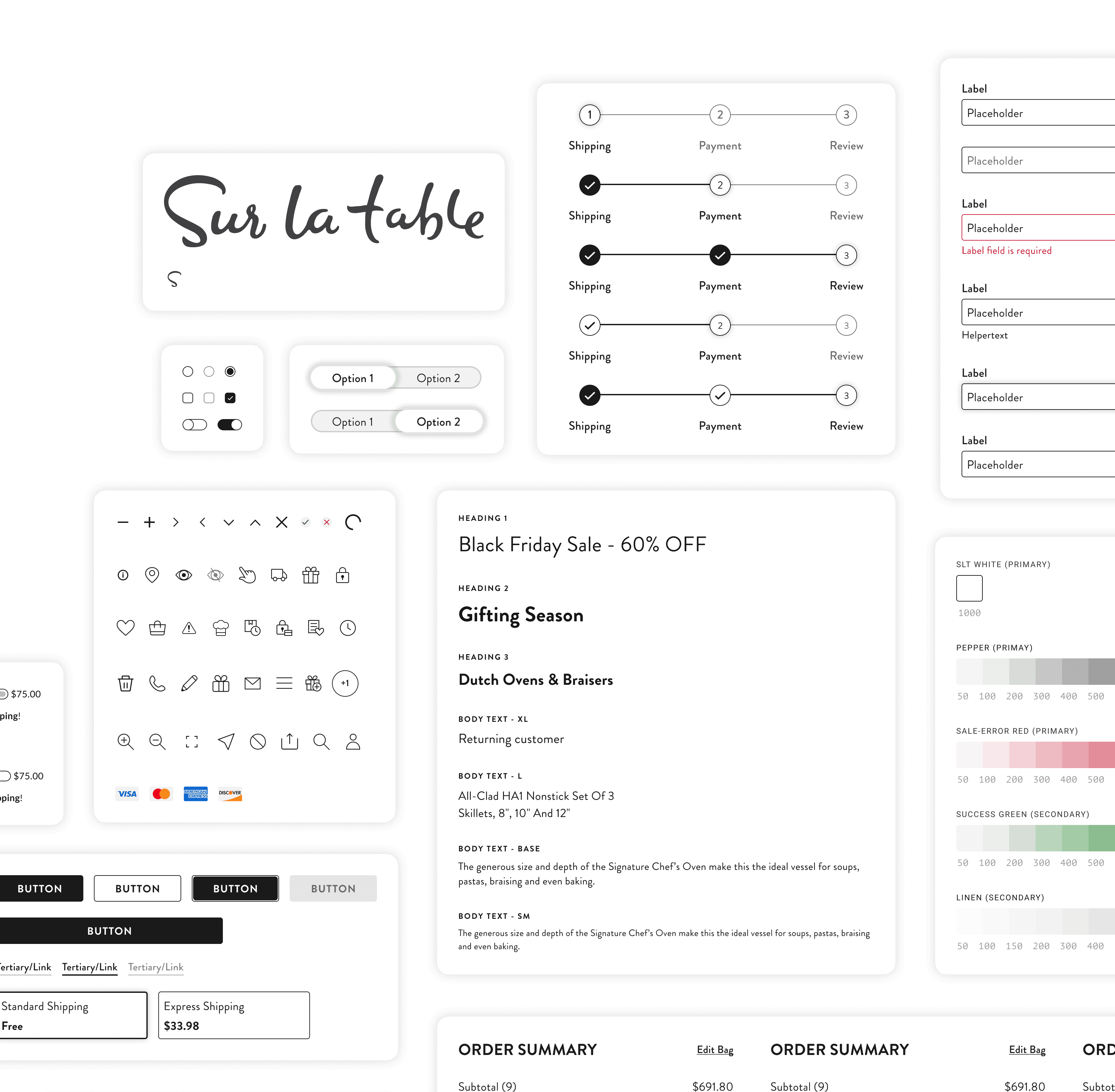
A foundation includes grid, typography, color, and logo usage. The base of this design system was the checkout project, where I transformed every element and widget into components with adjustable variables, such as buttons, icons, input fields, checkboxes and many more.
A foundation includes grid, typography, color, and logo usage. The base of this design system was the checkout project, where I transformed every element and widget into components with adjustable variables, such as buttons, icons, input fields, checkboxes and many more.


Benefits
Single Source of Truth
Design system serves as a centralized repository for components, patterns, and styles
Design system serves as a centralized repository for components, patterns, and styles
Scalable Redesigns
Enables efficient management of design changes across multiple projects
Enables efficient management of design changes across multiple projects
Focus on Complexity
Allows design resources to concentrate on complex problems rather than minor visual adjustments, ensuring consistency in appearance and functionality
Allows design resources to concentrate on complex problems rather than minor visual adjustments, ensuring consistency in appearance and functionality
Quick Replication
Facilitates rapid design replication using pre-made components and elements
Facilitates rapid design replication using pre-made components and elements
Eliminates Redundancy
Reduces the need to reinvent the wheel and ensures uniformity across designs
Reduces the need to reinvent the wheel and ensures uniformity across designs
Minimizes Miscommunication
Decreases the amount of valuable design and development time that may be wasted due to miscommunication
Decreases the amount of valuable design and development time that may be wasted due to miscommunication

Component Build
I created flexible, reusable components with multiple variables for quick customization and efficiency. Each component was designed to allow for easy element swaps, meeting project needs efficiently. I also built more complex components from these foundations to ensure system scalability.
I created flexible, reusable components with multiple variables for quick customization and efficiency. Each component was designed to allow for easy element swaps, meeting project needs efficiently. I also built more complex components from these foundations to ensure system scalability.
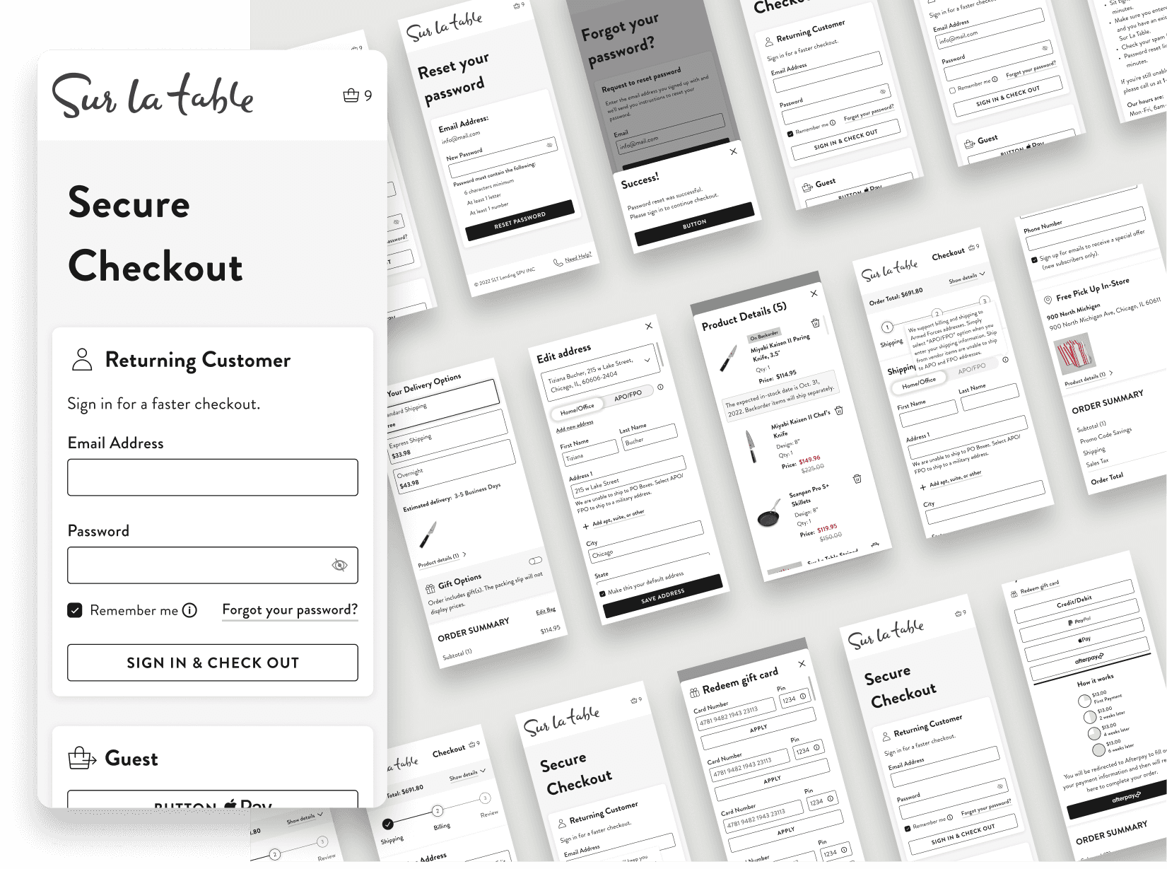
As the system evolved, our development team integrated all components into Storybook, thus creating a live library. To support responsive design, I added multiple component sizes for different breakpoints, thereby ensuring seamless adaptation across devices and enhancing system flexibility.
As the system evolved, our development team integrated all components into Storybook, thus creating a live library. To support responsive design, I added multiple component sizes for different breakpoints, thereby ensuring seamless adaptation across devices and enhancing system flexibility.

Challenges and Solutions
My biggest challenge while building the design system arose in the initial phase. I developed all components based on the "Checkout" project using the font "Brandon Grotesque," which we had chosen for its readability for our primary users (older women), who found our previous font, “Lato,” difficult to read. The rounded corners and high x-height of the font “Brandon Grotesque” enhance legibility and are in alignment with the client’s brand. However, after implementing the new font across all components and having the development team use it to build the checkout experience, we faced unexpected pushback from some stakeholders. Consequently, the solution was to update all components with a new font, namely "TT Norms Pro."
My biggest challenge while building the design system arose in the initial phase. I developed all components based on the "Checkout" project using the font "Brandon Grotesque," which we had chosen for its readability for our primary users (older women), who found our previous font, “Lato,” difficult to read. The rounded corners and high x-height of the font “Brandon Grotesque” enhance legibility and are in alignment with the client’s brand. However, after implementing the new font across all components and having the development team use it to build the checkout experience, we faced unexpected pushback from some stakeholders. Consequently, the solution was to update all components with a new font, namely "TT Norms Pro."
Measurable Result
The Design System Consists of the Following:
40 new reusable components that enhance design efficiency
100+ consistent styles, including typography and color a grid system for five breakpoints, ensuring a responsive design
All components follow a consistent 4px grid system for visual harmony
Most components are integrated into Storybook for fast developer access and seamless project integration
Project process speed was increased
Logical structure that allows for easy expansion with new design widgets when needed
Takeaway
Building our design system from scratch helped streamline my design process significantly and further emphasized the importance of structure and flexibility. I learned to take future needs for a scalable system into consideration. It was rewarding to see developers easily integrate components through Storybook, showcasing the impact of my work. Additionally, adapting to the challenge of rebuilding all components with the new font "TT Norms Pro" reinforced the necessity of flexibility in design.
Building our design system from scratch helped streamline my design process significantly and further emphasized the importance of structure and flexibility. I learned to take future needs for a scalable system into consideration. It was rewarding to see developers easily integrate components through Storybook, showcasing the impact of my work. Additionally, adapting to the challenge of rebuilding all components with the new font "TT Norms Pro" reinforced the necessity of flexibility in design.
See More Case Studies


See More Case Studies
See More Case Studies
See More Case Studies
Thanks For Watching

© Tiziana Bucher 2025. All Rights Reserved
Thanks For Watching
© Tiziana Bucher 2025. All Rights Reserved
Thanks For Watching
© Tiziana Bucher 2025. All Rights Reserved
Thanks For Watching
© Tiziana Bucher 2025. All Rights Reserved