Redesign of 404 Page
Redesign of 404 Page
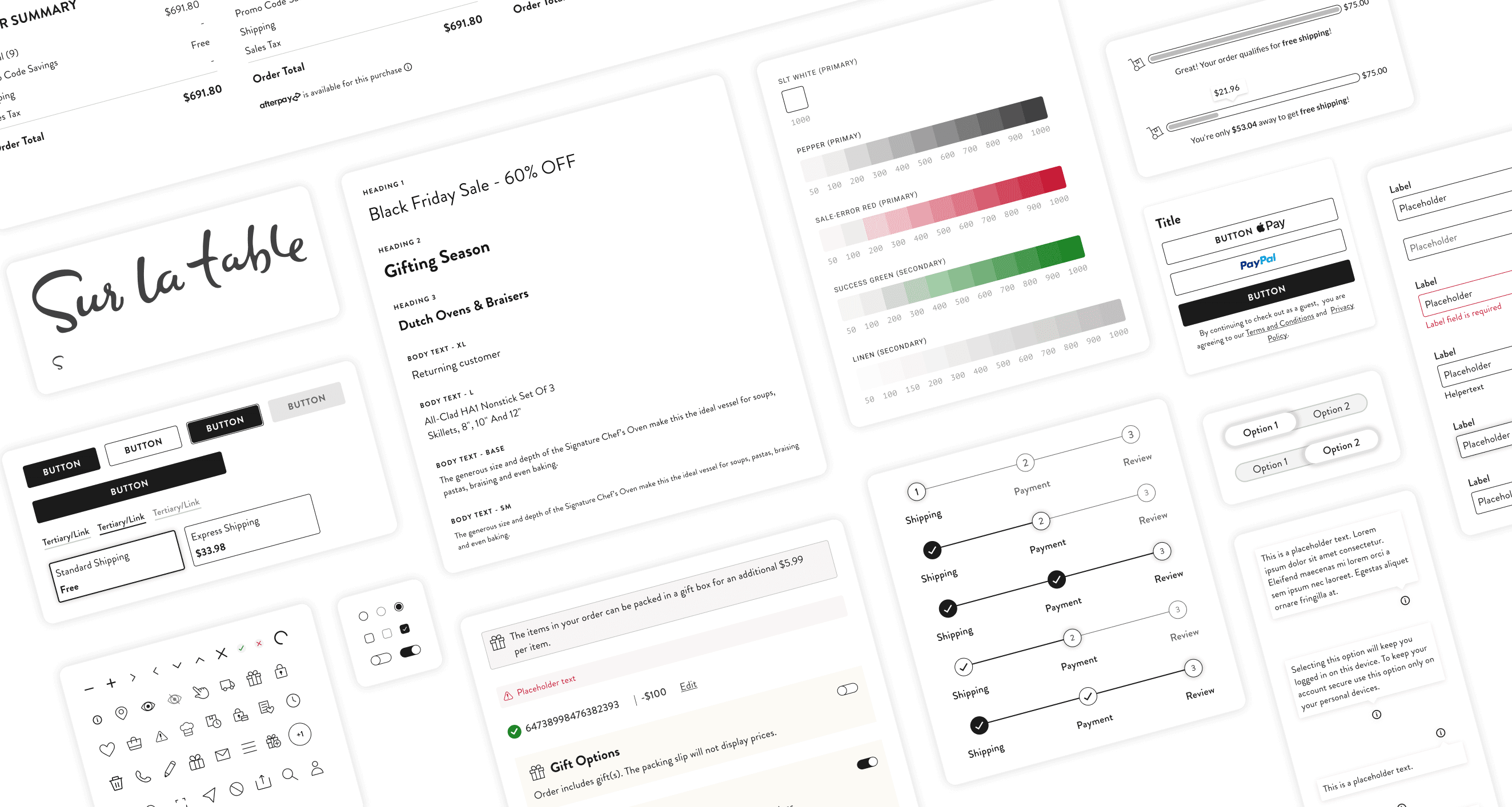
Sur La Table
The client’s error page needs to be redesigned. I was able to tackle this page right after handing off the product detail page to the development team.

Project Overview
Project Overview
The goal was to revitalize the 404 page experience and enhance its often overlooked potential by addressing clutter and spacing issues, and aligning its aesthetics with the new design of the client’s brand. The project goal was to seamlessly guide users back to their shopping journey by integrating elements from the new design system and other projects like PDP or checkout.
The goal was to revitalize the 404 page experience and enhance its often overlooked potential by addressing clutter and spacing issues, and aligning its aesthetics with the new design of the client’s brand. The project goal was to seamlessly guide users back to their shopping journey by integrating elements from the new design system and other projects like PDP or checkout.
Design Process
Design Process
Research Phase
Research
Analysis
Competitor Research
Evaluate Current Page:
Evaluate Current Page: Conduct a thorough analysis of the client’s existing 404 page and identify pain points, usability issues, and areas for improvement.
Evaluate Current Page: Conduct a thorough analysis of the client’s existing 404 page and identify pain points, usability issues, and areas for improvement.
Competitor Analysis:
Explore competitor solutions for 404 pages. Assess their strengths, weaknesses, and innovative approaches to the overall user experience.
Explore competitor solutions for 404 pages. Assess their strengths, weaknesses, and innovative approaches to the overall user experience.
Design Phase
Design Patterns
Design System
Grid System
Image Library
Conceptualization
Brainstorm ideas and concepts based on my research findings. Define the user experience and visuals for the redesigned 404 page.
Brainstorm ideas and concepts based on my research findings. Define the user experience and visuals for the redesigned 404 page.
Image Selection
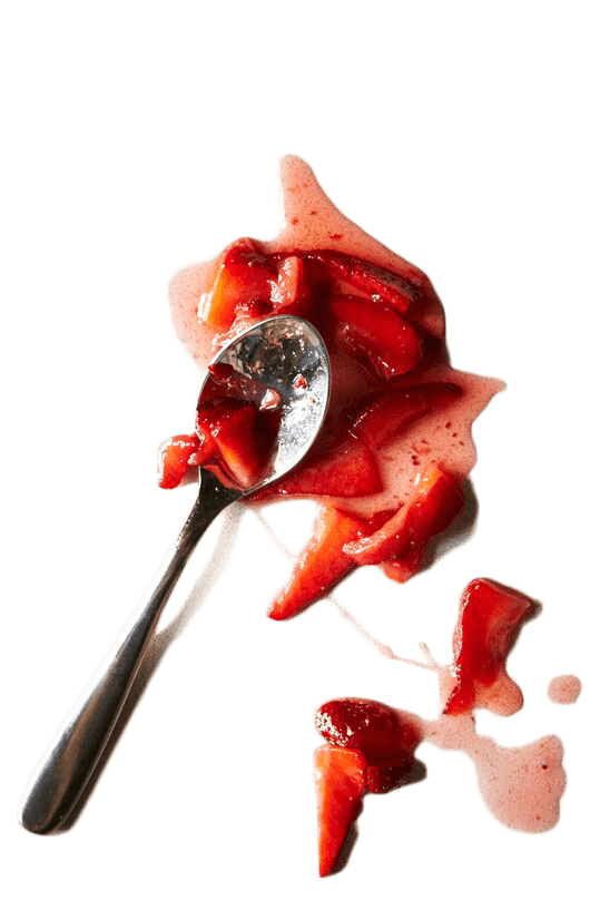
Search the client’s image archive for visuals that align with the desired tone and messaging of the 404 page, then select images that elicit the desired emotions and complement the overall design.
Search the client’s image archive for visuals that align with the desired tone and messaging of the 404 page, then select images that elicit the desired emotions and complement the overall design.
Wireframing and Prototyping
Create wireframes and low-fidelity prototypes to visualize the layout and structure of the new 404 page, then use the feedback from my product manager to iterate on the designs.
Create wireframes and low-fidelity prototypes to visualize the layout and structure of the new 404 page, then use the feedback from my product manager to iterate on the designs.
Development Phase
Collaboration
Responsive
Annotation
Design Q&A
Implementation
Collaborate with developers to translate the finalized design into code. Ensure that the design is responsive, accessible, and optimized for various devices and browsers.
Collaborate with developers to translate the finalized design into code. Ensure that the design is responsive, accessible, and optimized for various devices and browsers.
Research Phase

Mobile

Desktop
Pain Points
Cluttered page, no focus point
The title is hard to read, it’s very long, in uppercase letters, and spans the entire width of the page
In desktop view, the recommendation is below the fold-line
Hierarchy issues
Confusing navigation on one side of the page
Image does not fit to the page
Cluttered page, no focus point
The title is hard to read, it’s very long, in uppercase letters, and spans the entire width of the page
In desktop view, the recommendation is below the fold-line
Hierarchy issues
Confusing navigation on one side of the page
Image does not fit to the page
Competitors
I analyzed the 404 pages of competitors, focusing on visual design, content, use of color/image, and layout hierarchy.
I analyzed the 404 pages of competitors, focusing on visual design, content, use of color/image, and layout hierarchy.


Findings
Engaging images or illustrations that align with the brand’s style
Search bar to help users find what they were looking for
Most titles are short
Links/CTA to guide users back to the homepage or product categories
A lot of empty space on the sites
Engaging images or illustrations that align with the brand’s style
Search bar to help users find what they were looking for
Most titles are short
Links/CTA to guide users back to the homepage or product categories
A lot of empty space on the sites
Conceptualization
Conceptualization
I brainstormed ideas and concepts based on my research findings, then updated the layout, explored new images, and integrated a clear, friendly, sometimes even humorous message stating that the page couldn't be found.
I brainstormed ideas and concepts based on my research findings, then updated the layout, explored new images, and integrated a clear, friendly, sometimes even humorous message stating that the page couldn't be found.


Responsive
Responsive
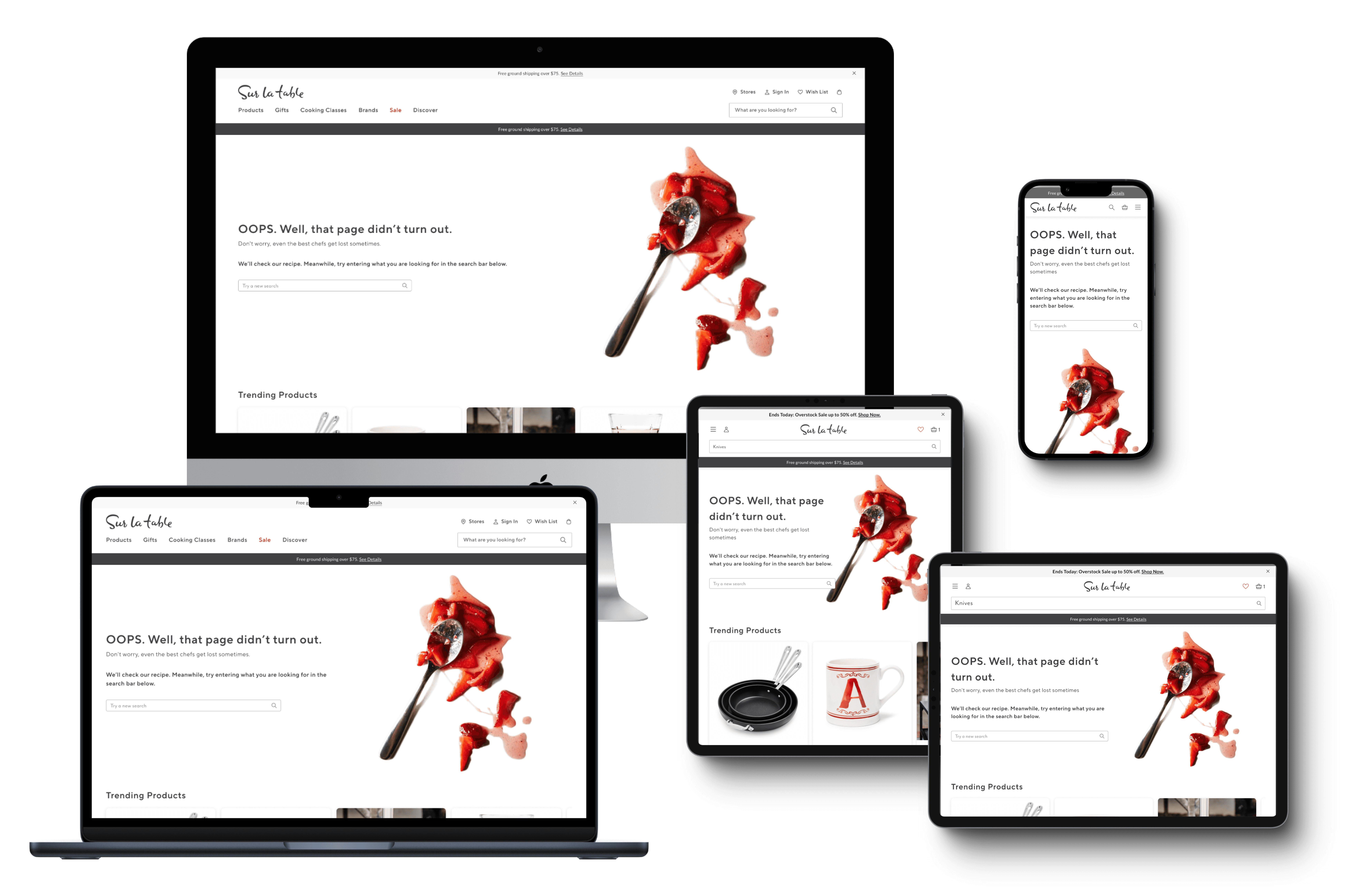
By ensuring that the client’s website was responsive, we were able to enhance the user experience. We had five breakpoints and designs that needed to be seamlessly adapted to all device sizes in order to boost accessibility and amplify engagement for greater success.
By ensuring that the client’s website was responsive, we were able to enhance the user experience. We had five breakpoints and designs that needed to be seamlessly adapted to all device sizes in order to boost accessibility and amplify engagement for greater success.

Old and New (click to zoom)
Old to New
Old to New
I refreshed the design to address previous issues regarding spacing, outdated elements, and clutter. The new layout introduced a clear hierarchy and incorporated familiar widgets from the product detail and store location pages, such as the recommendation widget and shop featured categories, to enhance the user’s shopping experience. The search bar is now more prominently placed right below the main message. Additionally, the image now accurately reflects the intended meaning of this page, namely that “something went wrong...”.
I refreshed the design to address previous issues regarding spacing, outdated elements, and clutter. The new layout introduced a clear hierarchy and incorporated familiar widgets from the product detail and store location pages, such as the recommendation widget and shop featured categories, to enhance the user’s shopping experience. The search bar is now more prominently placed right below the main message. Additionally, the image now accurately reflects the intended meaning of this page, namely that “something went wrong...”.
Final Result
Final Result
Mobile Walk-Through (click to play)
Desktop Walk-Through (click to play)
See More Case Studies

See More Case Studies
See More Case Studies
See More Case Studies
Thanks For Watching

© Tiziana Bucher 2025. All Rights Reserved
Thanks For Watching
© Tiziana Bucher 2025. All Rights Reserved
Thanks For Watching
© Tiziana Bucher 2025. All Rights Reserved
Thanks For Watching
© Tiziana Bucher 2025. All Rights Reserved