
Sur La Table
Checkout redesign
Redesigning checkout for a smoother, user-friendly experience.
Sur La Table
Checkout Redesign
Redesigning a checkout page for a smoother, more user-friendly experience.
Sur La Table
Checkout redesign
Redesigning checkout for a smoother, user-friendly experience.
Sur La Table
Checkout Redesign
Redesigning a checkout page for a smoother, more user-friendly experience.
Tools:
Tools:
Tools:

Project Overview
Our client's goal was to redesign their checkout flow for a more user-centered experience and to boost conversion by 2%. The aim was to reduce cart abandonment and enhance customer satisfaction.
Our client's goal was to redesign their checkout flow for a more user-centered experience and to boost conversion by 2%. The aim was to reduce cart abandonment and enhance customer satisfaction.
Our client's goal was to redesign their checkout flow for a more user-centered experience and to boost conversion by 2%. The aim was to reduce cart abandonment and enhance customer satisfaction.
Tools:
Design Process
The process involved three key phases geared towards ensuring a user-friendly experience, resolving pain points, and enhancing satisfaction.
1. Research to identify problems and solutions.
2. Ideation and Design (from Greyscaling to Mockups).
3. Post-launch UserTesting with performance analysis.
The process involved three key phases geared towards ensuring a user-friendly experience, resolving pain points, and enhancing satisfaction.
1. Research to identify problems and solutions.
2. Ideation and Design (from Greyscaling to Mockups).
3. Post-launch UserTesting with performance analysis.
Problem
Problem
Customers face several challenges in our checkout flow, from adding items to the bag, to completing orders. These friction points disrupt the process, leading to higher cart abandonment at checkout and increased bounce rates throughout the funnel.
Customers face several challenges in our checkout flow, from adding items to the bag, to completing orders. These friction points disrupt the process, leading to higher cart abandonment at checkout and increased bounce rates throughout the funnel.
Objectives
Objectives
Streamline checkout process
Simplify forms
Enhance personalized flows for SLT customer types (Gifting, In-Store Pickup, Cooking Classes, etc.)
Boost checkout speed and performance
Optimize for mobile responsiveness
Strengthen security measures for sensitive information, such as credit card details
Research
User Flow
User Flow
To effectively predict and assess user interactions, my team and I created the following flowchart to visualize the various pathways users might take during the checkout process.
To effectively predict and assess user interactions, my team and I created the following flowchart to visualize the various pathways users might take during the checkout process.

Flow diagram of the checkout process
Flow diagram of the checkout process (click to zoom)
Competitor Research
Competitor Research
To pinpoint improvement, we evaluated our design against established usability guidelines and compared it with the design of 11 competitors.
To pinpoint improvement, we evaluated our design against established usability guidelines and compared it with the design of 11 competitors.


One pager vs. multi steps checkout (click to zoom)
One pager vs. multi steps checkout
Findings
Findings
The two most common checkout versions are:
- a one-page version with accordions (which we currently have)
- and 2nd version with a separate page for each step.To save space, 8 out of 12 sites place labels inside the input fields.
On desktop, input fields are paired together (side by side).
All competitors show the user all the information they have filled in within a closed dropdown, with easy access to edit it.
4 out of 12 competitors use “Continue to [next step]” as the CTA to proceed.
4 out of 12 competitors feature a “Verify address/Edit” popup.
11 out of 12 competitors have the expiration date (MM/YY) in a single input field. Only one competitor uses the format we currently have, with separate dropdowns for the month and year.
7 out of 12 competitors label it “Security Code.” The rest are split between “CVN,” “CVV,” and “CVC/CVV.”
None of our competitors (0 out of 12) require users to choose the card type. As soon as the user enters the first digits of the credit card number, the system automatically detects whether it is Visa, Maestro, or another card type.
7 out of 12 competitors offer a gift message/wrapping option, with 4 of them providing it for individual products.
Two common checkout types: one-page with accordions (current) and multi-step with separate pages.
8 of 12 sites place labels inside input fields to save space.
Input fields are paired side by side on desktop.
All competitors allow users to easily edit information via a closed dropdown.
4 of 12 use “Continue to [next step]” as the CTA.
4 of 12 offer a "Verify address/Edit" popup.
11 of 12 use a single input field for expiration date (MM/YY); only 1 uses separate dropdowns.
7 of 12 label it “Security Code,” with others split between “CVN,” “CVV,” or “CVC/CVV.”
None require selecting the card type; systems auto-detect based on the first digits.
7 of 12 offer a gift message/wrapping option, with 4 offering it per product.
Findings
Findings
Two common checkout types: One-pager with accordions (client's current checkout) and a multi-step approach with separate pages for each step
8 of 12 use a multi-step checkout
8 of 12 sites place labels inside input fields to save space
Input fields are paired side by side in desktop view
All competitors allow users to easily edit information via a closed dropdown
4 of 12 use “Continue to [next step]” as the CTA
4 of 12 offer a "Verify address/Edit" popup
11 of 12 use a single input field for expiration date (MM/YY); only 1 uses separate dropdowns
7 of 12 label it “Security Code,” while others use “CVN,” “CVV,” or “CVC/CVV”
None require selecting the card type; systems auto-detect based on the first digits
7 of 12 offer a gift message/wrapping option, with 4 offering it per product
Customer Voice
Customer Voice
Direct customer feedback is important when it comes to shaping my designs. Understanding their thoughts and insights helps me tailor the user experience to their needs and preferences.
Direct customer feedback is important when it comes to shaping my designs. Understanding their thoughts and insights helps me tailor the user experience to their needs and preferences.
“Trying to edit my checkout! Can’t seem to get there!”
“Trying to edit my checkout! Can’t seem to get there!”
“Not user-friendly. Very confusing checkout process.”
“Not user-friendly. Very confusing checkout process.”
“Canceled order as the checkout process is horrible!!”
“Canceled order as the checkout process is horrible!!”
“I would order from you but it is VERY difficult to complete the order at checkout. It's very frustrating because I could not finish the process for check out.”
“I would order from you but it is VERY difficult to complete the order at checkout. It's very frustrating because I could not finish the process for check out.”
“Special offer discount to receive texts excluded from sale. Very misleading, hurts trust. Checkout cumbersome.”
“Special offer discount to receive texts excluded from sale. Very misleading, hurts trust. Checkout cumbersome.”
“I have enjoyed doing some Christmas shopping on Sur La Table, however, the checkout is a little convoluted to navigate.”
“I have enjoyed doing some Christmas shopping on Sur La Table, however, the checkout is a little convoluted to navigate.”
What customers say about the checkout process.
Ideation and Design
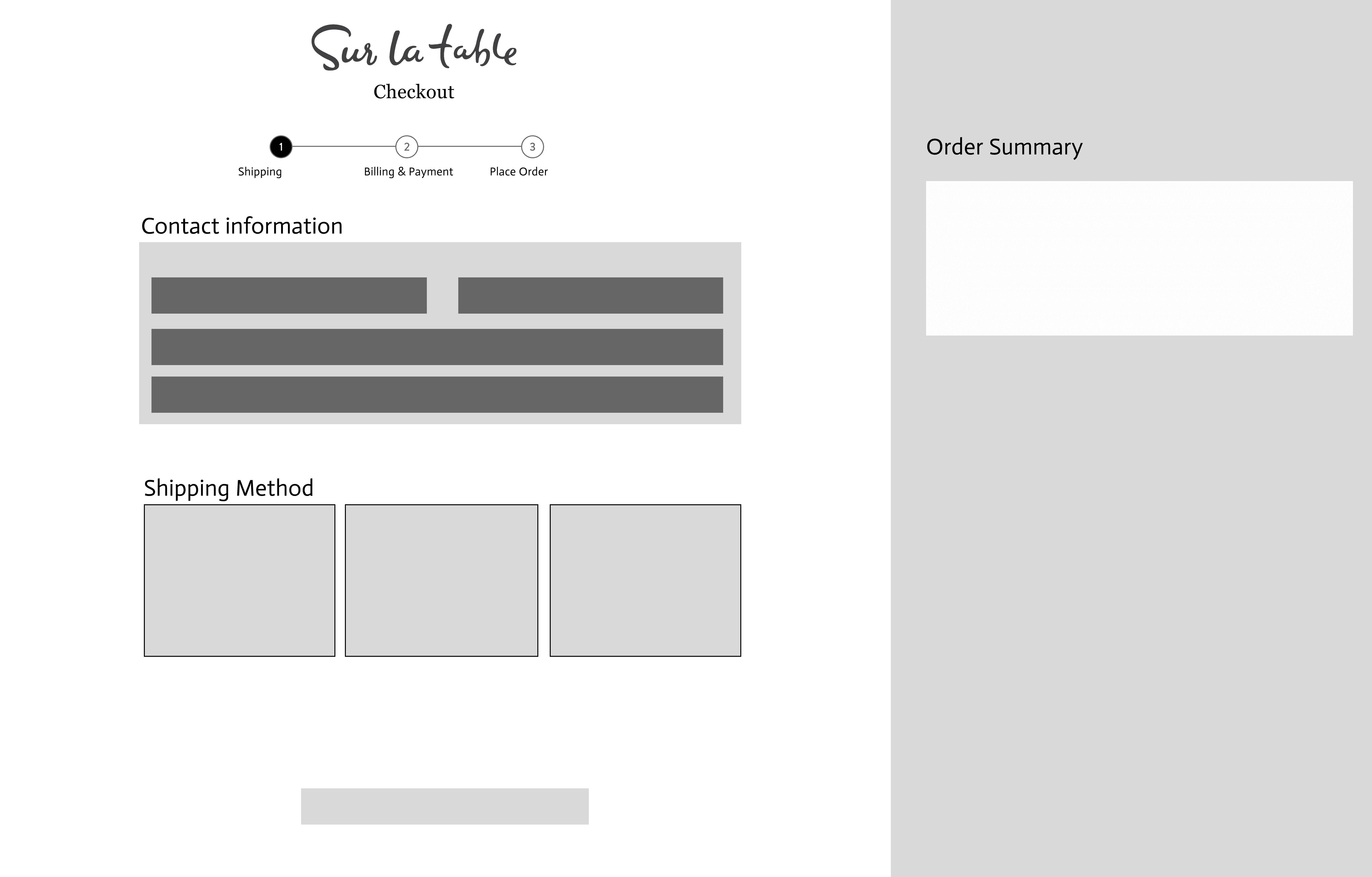


Lo-Fi Wireframes of the Shipping Step
Wireframes
Wireframes
My research brought to light that a step-by-step approach is more effective than a one-pager. By rapidly developing low-fidelity wireframes, I was able to quickly assess key layout design decisions and ensure alignment with my product manager regarding user needs.
My research brought to light that a step-by-step approach is more effective than a one-pager. By rapidly developing low-fidelity wireframes, I was able to quickly assess key layout design decisions and ensure alignment with my product manager regarding user needs.
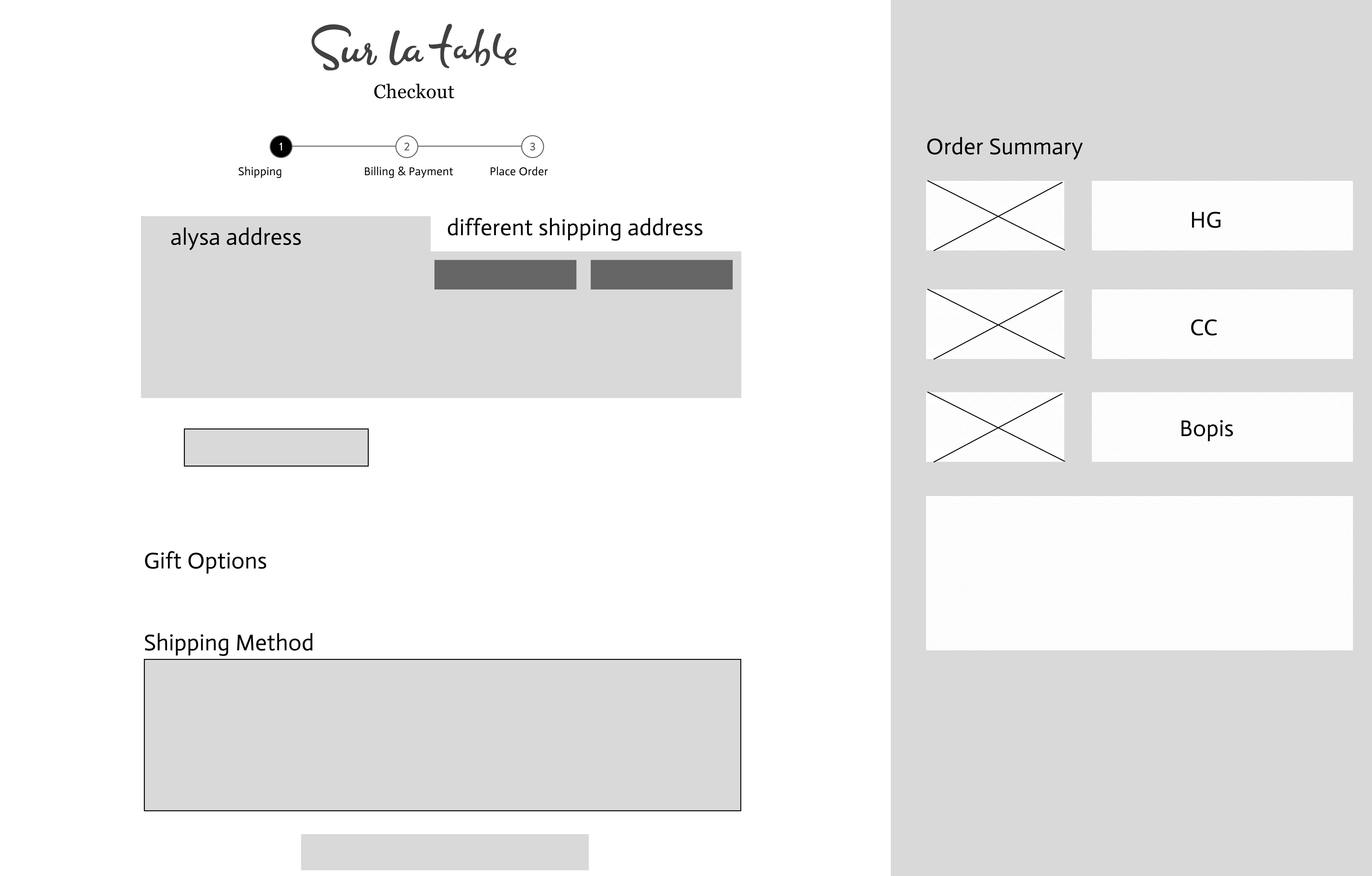
Design Mockups
Design Mockups
During this phase, I explored and designed around 50 different scenarios. I focused on covering all use cases from "Happy Paths" to "Error Screens", and thought about tooltips, links, forms, side drawers, bottom sheets, tabs, and images, and making adjustments for user-friendliness. I collaborated with my product manager and co-designer to eliminate unnecessary widgets and refine the overall experience.
During this phase, I explored and designed around 50 different scenarios. I focused on covering all use cases from "Happy Paths" to "Error Screens", and thought about tooltips, links, forms, side drawers, bottom sheets, tabs, and images, and making adjustments for user-friendliness. I collaborated with my product manager and co-designer to eliminate unnecessary widgets and refine the overall experience.
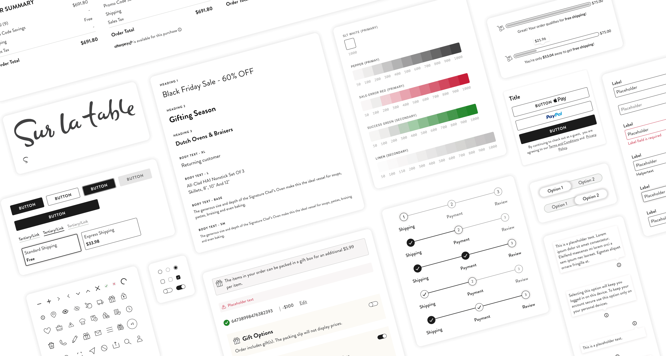
Design System
While redesigning our checkout process, my product manager made sure I had time to develop a design system based on the checkout project.
I built components for every widget, including colors, fonts, a grid system for our 4 breakpoints, buttons, links, toggles, and more. Our goal was to ensure reusability for future projects, easy updates, and consistency across all breakpoints, and in doing so, we created a base that will help streamline future projects and serve as a reference for any design changes.
Font
Based on feedback from our client’s primary users - in this case older women - my team and I learned that the current font, “Lato”, is difficult to read. Thus, to enhance readability, we chose the font "Brandon Grotesque" for the checkout redesign.
The font’s rounded corners give it an organic feel that aligns with the brand
The high x-height ensures a better readability
Brandon Grotesque
Regular
Regular
Bold
Bold
Color
To enhance the site's visual appeal and functionality, my team and I expanded the color palette beyond the colors currently being used primarily for sales (black, white, and red).
Introducing two new colors into the design system:
A soft beige-gray and a vibrant success green
While the beige-gray offers a subtle touch, the success green serves to highlight and reinforce positive messaging throughout the user journey


Breakpoints without grid
Breakpoints with grid

Hover over the image to see it without a grid.
Grids & Breakpoints
Grids & Breakpoints
I created a grid system for 4 layouts for our key breakpoints. Since nearly 70% of users access the site on mobile devices (375px), we chose to start designing at 375px rather than the more common 320px. While crafting distinct user experiences for each breakpoint, we ensured seamless adaptation, thereby boosting accessibility and enhanced user engagement.
I created a grid system for 4 layouts for our key breakpoints. Since nearly 70% of users access the site on mobile devices (375px), we chose to start designing at 375px rather than the more common 320px. While crafting distinct user experiences for each breakpoint, we ensured seamless adaptation, thereby boosting accessibility and enhanced user engagement.
Breakpoints without grid
Breakpoints with grid
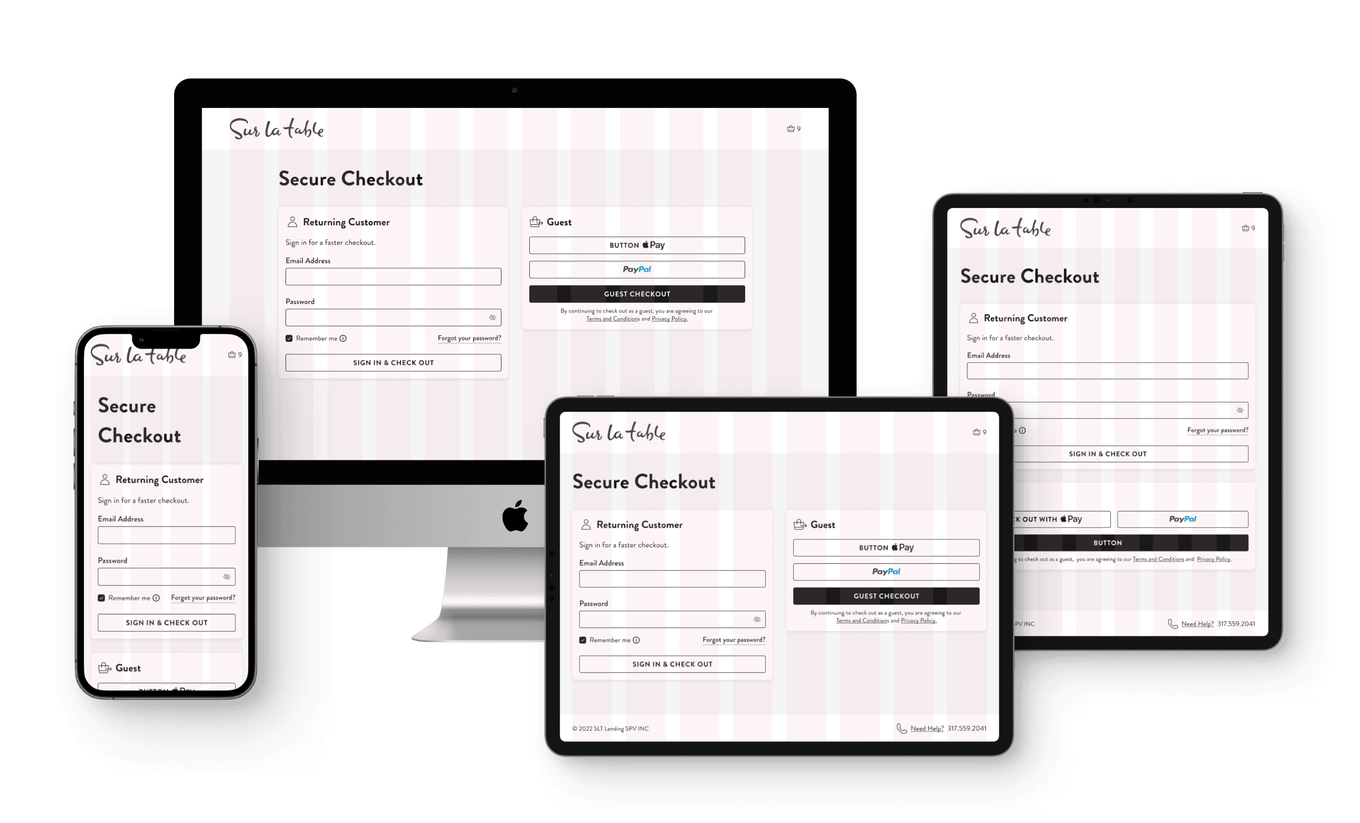
Easy Navigation
Discover the new checkout experience. Based on the research conducted, my team and I transitioned from a one-pager layout to a four-page process. This design allows users to focus on one task at a time, making navigation simpler and more efficient.
Discover the new checkout experience. Based on the research conducted, my team and I transitioned from a one-pager layout to a four-page process. This design allows users to focus on one task at a time, making navigation simpler and more efficient.
Discover the new checkout experience. Based on the research conducted, my team and I transitioned from a one-pager layout to a four-page process. This design allows users to focus on one task at a time, making navigation simpler and more efficient.
Discover the new checkout experience. Based on the research conducted, my team and I transitioned from a one-pager layout to a four-page process. This design allows users to focus on one task at a time, making navigation simpler and more efficient.
Before and After
Before and After
Before and After
1
Old Login Accordion
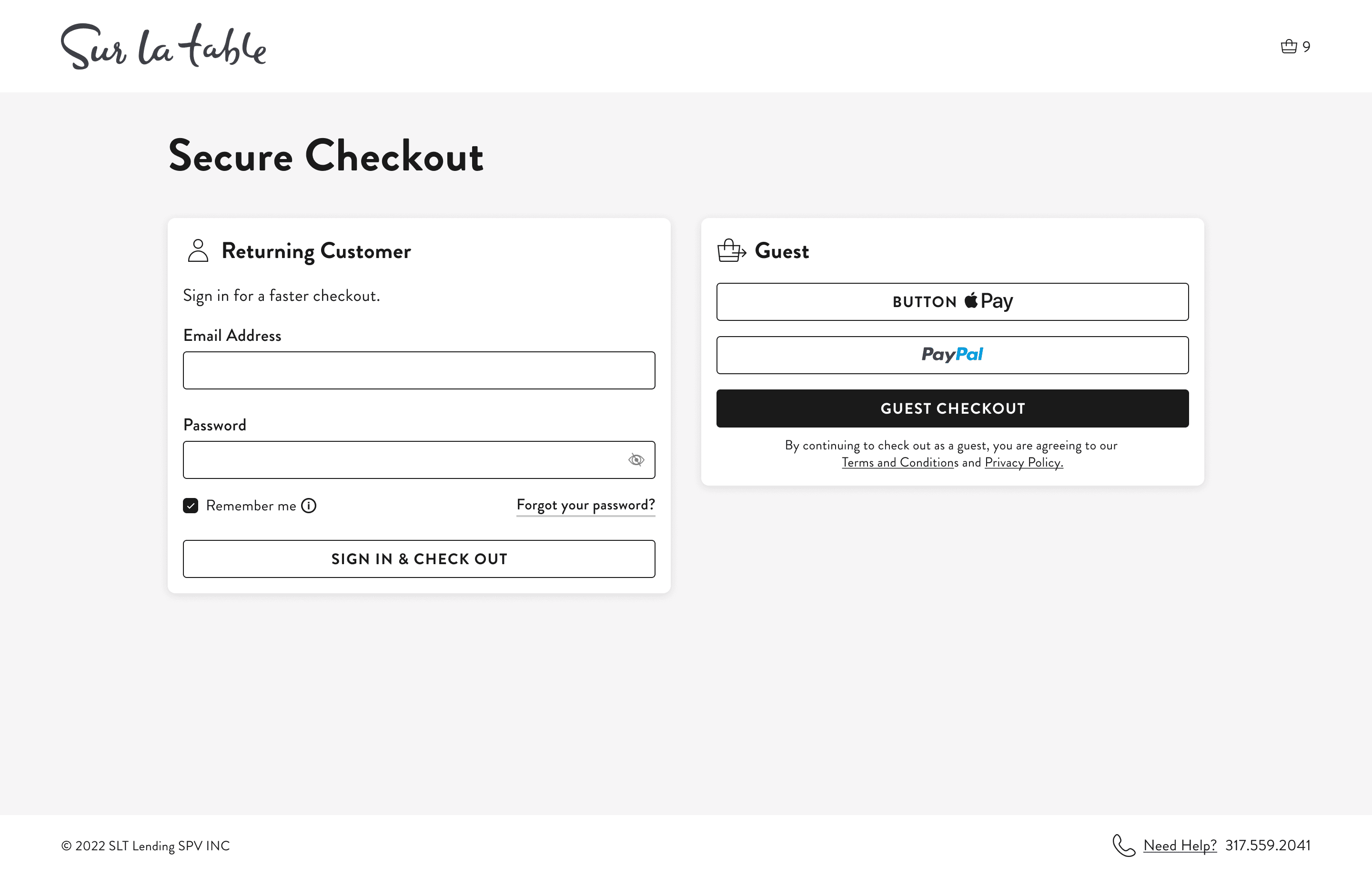
New Login Page
Login
The login page is divided into two sections: 'Returning Customer' and 'Guest Checkout.' For a quicker checkout experience, options like Apple Pay and PayPal are grouped under 'Guest Checkout.' To add depth and better emphasize these options, the cards are highlighted against a warm gray background.
2

Old Shipping Accordion

New Shipping Page
Shipping
The input fields were combined into separate cards for 'Shipping Address' and 'Contact Information.' This approach improved the process by making it more intuitive and space-efficient. Additionally, the cards dynamically adjust depending on the products in the cart and whether the user is a returning customer or not.
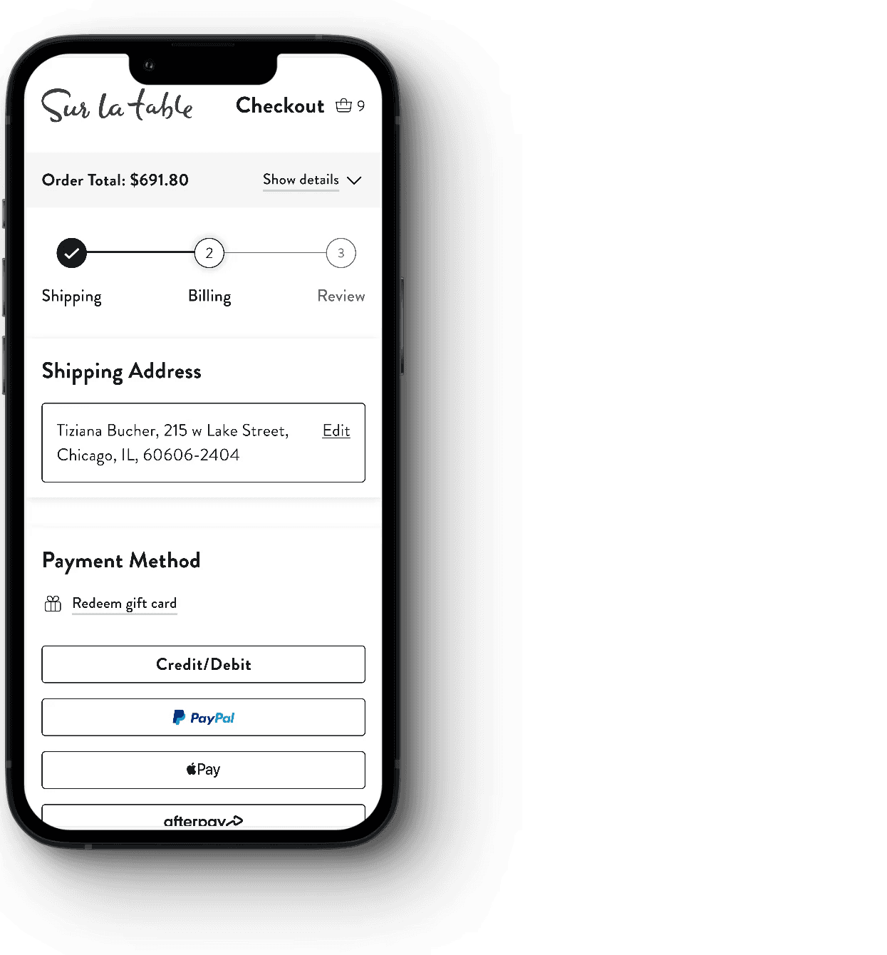
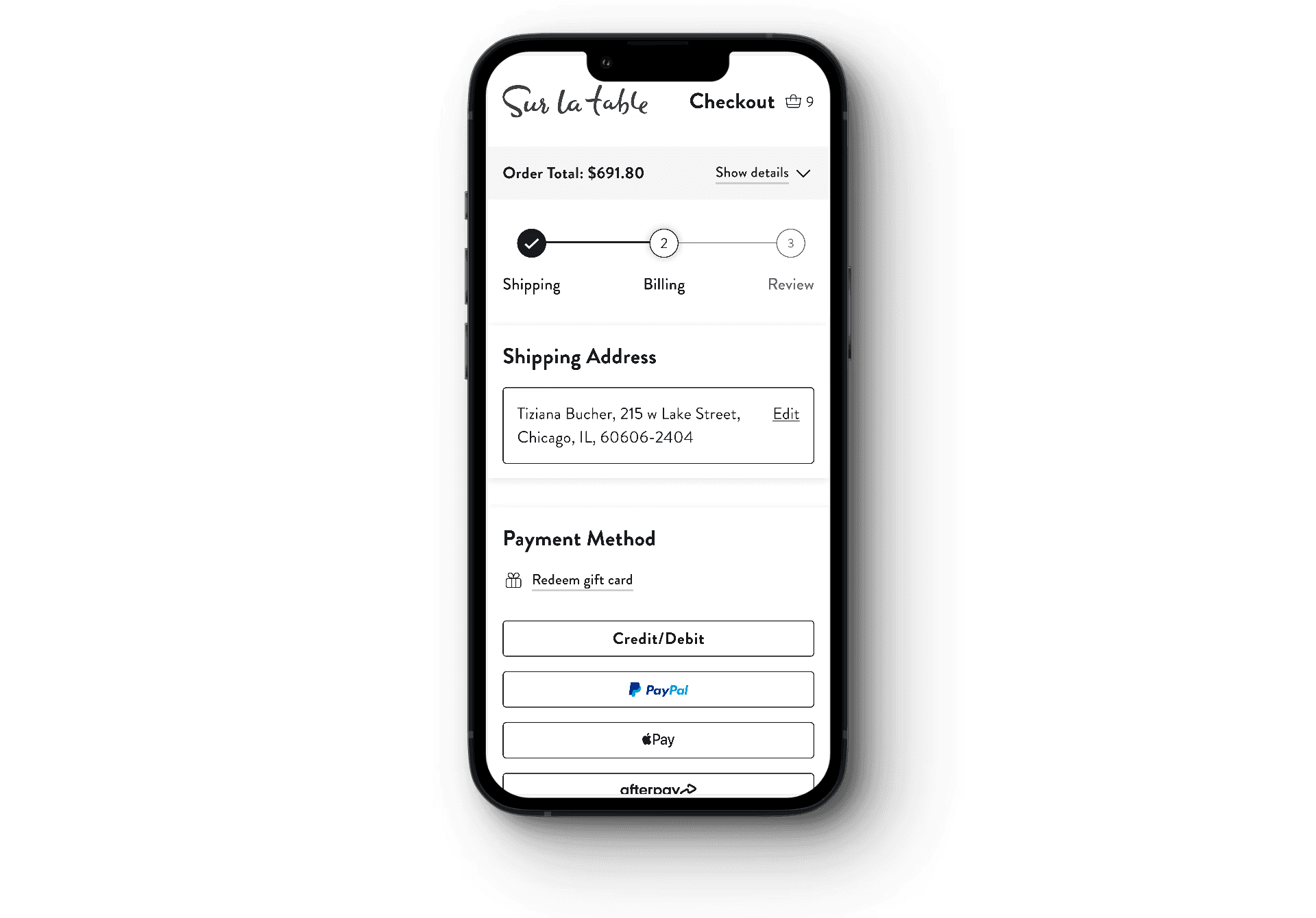
3
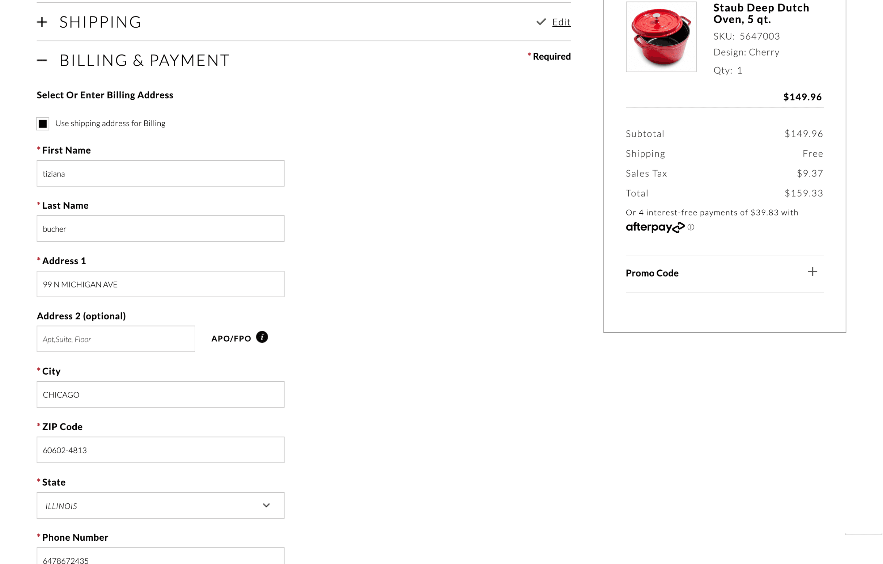
Old Billing Accordion

New Billing Page
Billing
The shipping address is automatically carried over to the billing step, allowing users to quickly review and edit if necessary. The credit card option is selected by default, thereby seamlessly guiding users to the next step and simplifying the overall experience.
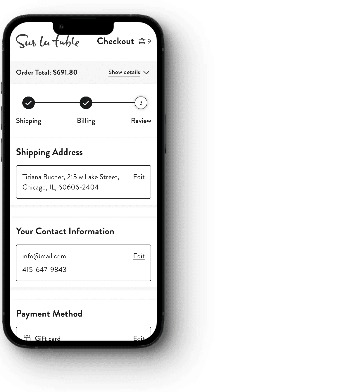
4

Old Review Accordion

New Review Page
Review
Giving users the opportunity to review all information for accuracy before they finalize their purchase contributes to a seamless checkout experience and helps build trust. If any adjustments are needed, users can simply click 'Edit' next to the relevant section or use the top progress bar to navigate back to any previous step.
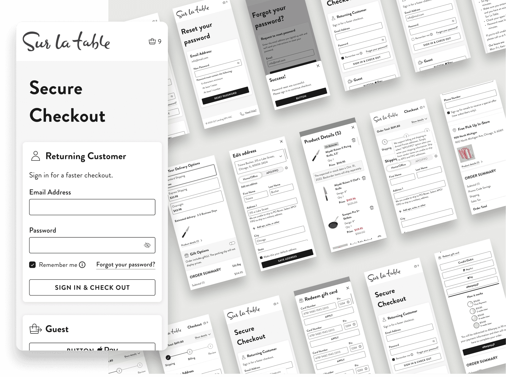
Login Step
Login Step


Shipping Step
Shipping Step


Billing Step
Billing Step
Review Step
Review Step
Before and After
Before and After
Login
Old Login Accordion
New Login Page
The login page is divided into two sections: 'Returning Customer' and 'Guest Checkout.' For a quicker checkout experience, options like Apple Pay and PayPal are grouped under 'Guest Checkout.' To add depth and better emphasize these options, the cards are highlighted against a warm gray background.
Shipping
Old Shipping Accordion
New Shipping Page
The input fields were combined into separate cards for 'Shipping Address' and 'Contact Information.' This approach improved the process by making it more intuitive and space-efficient. Additionally, the cards dynamically adjust depending on the products in the cart and whether the user is a returning customer or not.
Billing
Old Billing Accordion
New Billing Page
The shipping address is automatically carried over to the billing step, allowing users to quickly review and edit if necessary. The credit card option is selected by default, thereby seamlessly guiding users to the next step and simplifying the overall experience.
Review
Old Review Accordion
New Review Page
Giving users the opportunity to review all information for accuracy before they finalize their purchase contributes to a seamless checkout experience and helps build trust. If any adjustments are needed, users can simply click 'Edit' next to the relevant section or use the top progress bar to navigate back to any previous step.
1
Old Login Accordion
New Login Page
Login
The login page is divided into two sections: 'Returning Customer' and 'Guest Checkout.' For a quicker checkout experience, options like Apple Pay and PayPal are grouped under 'Guest Checkout.' To add depth and better emphasize these options, the cards are highlighted against a warm gray background.
2
Old Shipping Accordion
New Shipping Page
Shipping
The input fields were combined into separate cards for 'Shipping Address' and 'Contact Information.' This approach improved the process by making it more intuitive and space-efficient. Additionally, the cards dynamically adjust depending on the products in the cart and whether the user is a returning customer or not.
3
Old Billing Accordion
New Billing Page
Billing
The shipping address is automatically carried over to the billing step, allowing users to quickly review and edit if necessary. The credit card option is selected by default, thereby seamlessly guiding users to the next step and simplifying the overall experience.
4
Old Review Accordion
New Review Page
Review
Giving users the opportunity to review all information for accuracy before they finalize their purchase contributes to a seamless checkout experience and helps build trust. If any adjustments are needed, users can simply click 'Edit' next to the relevant section or use the top progress bar to navigate back to any previous step.
Final Result
Measurable Success
Measurable Success
Significant 6% conversion lift with new cart experience
Design for 4 breakpoints
Build 36 different components for new design system
50 different scenarios
Significant 6% conversion lift with new cart experience
Design for 4 breakpoints
Build 36 different components for new design system
50 different scenarios
Takeaway
This project highlighted the value of user-centered design, testing, and competitor research. I learned from multiple competitors how to use widgets more efficiently to minimize user relearning. It was also my first time building a design system – something I’m eager to refine for better brand consistency and faster design. Lastly, understanding users and their breakpoints is key to shaping design thinking and optimizing our digital precence.
Mobile Walkthrough (Click to play)
Mobile Walkthrough
(Click to play)
Desktop Walkthough (Click to play)
Takeaway
This project highlighted the value of user-centered design, testing, and competitor research. By researching multiple competitors, I learned how to use widgets more efficiently to minimize user relearning. It was also my first time building a design system – something I’m eager to continue refining for better brand consistency and faster design. Lastly, understanding users and their breakpoints is key to shaping design thinking and optimizing a client’s digital presence.
This project highlighted the value of user-centered design, testing, and competitor research. By researching multiple competitors, I learned how to use widgets more efficiently to minimize user relearning. It was also my first time building a design system – something I’m eager to continue refining for better brand consistency and faster design. Lastly, understanding users and their breakpoints is key to shaping design thinking and optimizing a client’s digital presence.
See More Case Studies


See More Case Studies
See More Case Studies
See More Case Studies
See More Case Studies
Thanks For Watching

© Tiziana Bucher 2025. All Rights Reserved
Thanks For Watching
© Tiziana Bucher 2025. All Rights Reserved
Thanks For Watching
© Tiziana Bucher 2025. All Rights Reserved
Thanks For Watching
© Tiziana Bucher 2025. All Rights Reserved