
Sur La Table
Sur La Table
Product Detail Page
Crafting a product detail page that speaks to the brand’s core values and drives conversions.
Crafting a product detail page that speaks to the brand’s core values and drives conversions.

Project overview
Project overview
When designing a product detail page (PDP), it's essential to not only showcase the product’s features but also infuse the brand’s identity into every element.
The revamped PDP is expected to lead to a more than 2% increase of the conversion rate. The primary objective was to refine user interaction and elevate engagement levels by incorporating more captivating elements, such as additional micro-interactions, storytelling features, and a broader selection of icons.
Design Process
Design Process
To begin, it was necessary to lay the foundation by understanding user shopping habits and the current page’s performance. Together with my manager, I investigated these habits and gathered insights.
To begin, it was necessary to lay the foundation by understanding user shopping habits and the current page’s performance. Together with my manager, I investigated these habits and gathered insights.
Discovery and Research
Discovery and Research
Research
Competitor Research
Hypotheses
Pain Points
Analysis
Information Architecture
My team and I researched, explored and analyzed competitor landscapes, customer feedback, and identifying key features and areas for improvement. In the define phase, we focused on user needs, goals, and pain points, ensuring the project aligned with the client’s expectations and was set up for success.
My team and I researched, explored and analyzed competitor landscapes, customer feedback, and identifying key features and areas for improvement. In the define phase, we focused on user needs, goals, and pain points, ensuring the project aligned with the client’s expectations and was set up for success.
My team and I researched, explored and analyzed competitor landscapes, customer feedback, and identifying key features and areas for improvement. In the define phase, we focused on user needs, goals, and pain points, ensuring the project aligned with the client’s expectations and was set up for success.
Ideation and Design
Ideation and Design
Design Patterns
Design System
Figma
Grid System
Visual Design
In the ideation phase, I envisioned and created multiple screens, wireframes, and interactive prototypes for various scenarios. Additionally, I developed and updated new styles and components for the new design system.
In the ideation phase, I envisioned and created multiple screens, wireframes, and interactive prototypes for various scenarios. Additionally, I developed and updated new styles and components for the new design system.
In the ideation phase, I envisioned and created multiple screens, wireframes, and interactive prototypes for various scenarios. Additionally, I developed and updated new styles and components for the new design system.
Final Result
Final Result
Design Q&A
Accessibility
Design System
Engineering
tag text
UX / UI Designer
Preparing the designs for release involves partnering with the development and QA teams. It’s important to not only ensure that all technical requirements are met, but that an aesthetically pleasing and satisfying visual experience - one that’s in alignment with the brand - is delivered as well.
Preparing the designs for release involves partnering with the development and QA teams. It’s important to not only ensure that all technical requirements are met, but that an aesthetically pleasing and satisfying visual experience - one that’s in alignment with the brand - is delivered as well.
Preparing the designs for release involves partnering with the development and QA teams. It’s important to not only ensure that all technical requirements are met, but that an aesthetically pleasing and satisfying visual experience - one that’s in alignment with the brand - is delivered as well.
DISCOVERY AND RESEARCH
DISCOVERY AND RESEARCH
Pain Points
Pain Points
Product details are hard to find, with the major culprits being Dimensions, Specs and “What’s in the box”
Product information such as product care, features, and dimensions are often inaccurate
Product descriptions are difficult to understand and weren't optimized for readability
Incomplete product details that lack decision-driving attributes
Customers are directed from email campaigns to product pages that show the product is “Out of stock”
Unclear whether the product is available or not
Customers face challenges when determining color, product finishing, scale, and included accessories

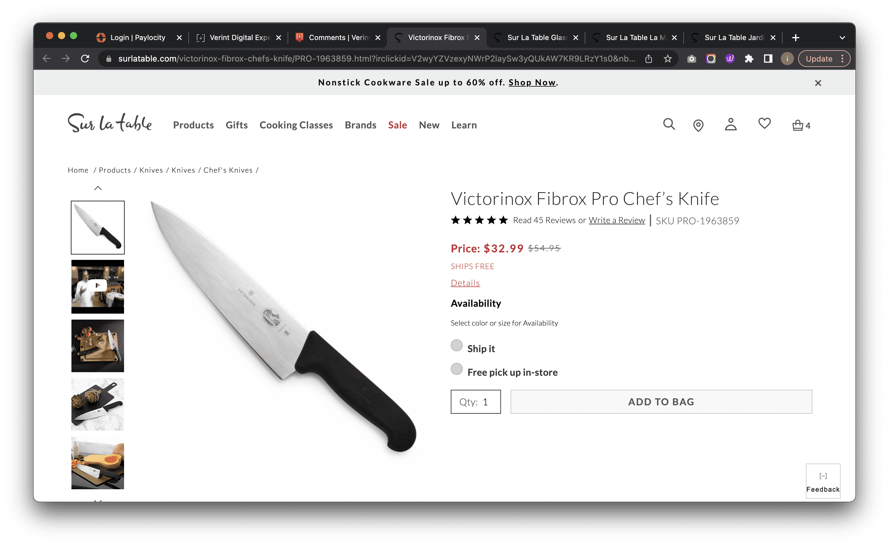
Current Product detail page (click to zoom)
Current Components
After analyzing the client’s current page and its components, I shifted my focus to how these specific components are implemented by their competitors.
1) Product Title
2) Product Images/Video
3) Customer Reviews and Ratings
4) Pricing Information
5) Afterpay
6) Shipping info
7) Variable
8) Product Availability
9) Add to Cart or Buy Now Button
10) Product Description
11) Product Specification
12) Care & Usage
13) Related Products / Recommendations
After analyzing the client’s current page and its components, I shifted my focus to how these specific components are implemented by their competitors.
1) Product Title
2) Product Images/Video
3) Customer Reviews and Ratings
4) Pricing Information
5) Afterpay
6) Shipping info
7) Variable
8) Product Availability
9) Quantity & Add to Bag CTA
10) Product Description
11) Product Specification
12) Care & Usage
13) Related Products / Recommendations
After analyzing the client’s current page and its components, I shifted my focus to how these specific components are implemented by their competitors.
1) Product Title
2) Product Images/Video
3) Customer Reviews and Ratings
4) Pricing Information
5) Afterpay
6) Shipping info
7) Variable
8) Product Availability
9) Add to Cart or Buy Now Button
10) Product Description
11) Product Specification
12) Care & Usage
13) Related Products / Recommendations
1) Product Title
2) Product Images/Video
3) Customer Reviews and Ratings
4) Pricing Information
5) Afterpay
6) Shipping info
7) Variable
8) Product Availability
9) Add to Cart or Buy Now Button
10) Product Description
11) Product Specification
12) Care & Usage
13) Related Products / Recommendations
In this step, I have analyzed our current page, examining all its components and sections. With this understanding, I will now prioritize my competitor research, focusing on each section individually.
Component
4
7
7
3
5
6
11
11
11
13
12
12
12
13
1
8
9
10
2
Components on current Product detail page (click to zoom)
Components on current Product detail page
Components on current Product detail page
Competitors
I used competitor research to identify industry standards, uncover user expectations, and pinpoint gaps in our own product. With it I made informed design decisions, ensuring our product stands out and meets user needs effectively.
We compared the overall visual appearance, amount of content, use of colors, diversity and hierarchy of 3 key sites in the field to our current PDP and recognized few things:
Competitors divided in section & color (click to zoom)
Competitors divided in section & color (click to zoom)
Sur La Table
2 colors
Sell focus: Less content then IKEA, hard sell vibe
Ikea
3 colors
Sell focus: Less content then Our Place, standard vibe
Our Place
6 colors
Content focus: Less content then Made In, diversity components, playful vibe
Made In
3 colors
Content focus: A lot content, diversity components, organized layout, information vibe
Competitors
Competitors
I used competitor research to identify industry standards, uncover user expectations, and pinpoint gaps in our own product. With it I made informed design decisions, ensuring our product stands out and meets user needs effectively.
I used competitor research to identify industry standards, uncover user expectations, and pinpoint gaps in our own product. With it I made informed design decisions, ensuring our product stands out and meets user needs effectively.
We compared the overall visual appearance, amount of content, use of colors, diversity and hierarchy of 3 key sites in the field to our current PDP and recognized few things:
Competitors
I used competitor research to identify industry standards, uncover user expectations, and pinpoint gaps in the client’s product. With this newfound information, I was able to make informed design decisions, ensuring the client’s product stands out and meets user needs effectively.
By comparing the overall visual appearance, amount of content, use of colors, diversity and hierarchy of three key sites in the field to the client’s current PDP, the following things stood out:
Sur La Table (Client)
2 colors
Sell Focus: Less content than IKEA, hard sell vibe
Ikea
3 colors
Sell Focus: Less content than Our Place, standard vibe
Our Place
6 colors
Content Focus: Less content than Made In, diversity components, playful vibe
Made In
3 colors
Content Focus: A lot of content, diversity components, organized layout, informational vibe
Competitors divided in section & color (click to zoom)
Competitors divided in section & color
Competitors divided in section & color
Sur La Table
Sur La Table
Sur La Table
2 colors
2 colors
Sell focus: Less content then IKEA, hard sell vibe
Ikea
Ikea
Ikea
3 colors
3 colors
Sell focus: Less content then Our Place, standard vibe
Our Place
Our Place
Our Place
6 colors
6 colors
Content focus: Less content then Made In, diversity components, playful vibe
Made In
Made In
Made In
3 colors
3 colors
Content focus: A lot content, diversity components, organized layout, information vibe
IDEATION AND DESIGN
IDEATION AND DESIGN
Wireframes
Wireframes
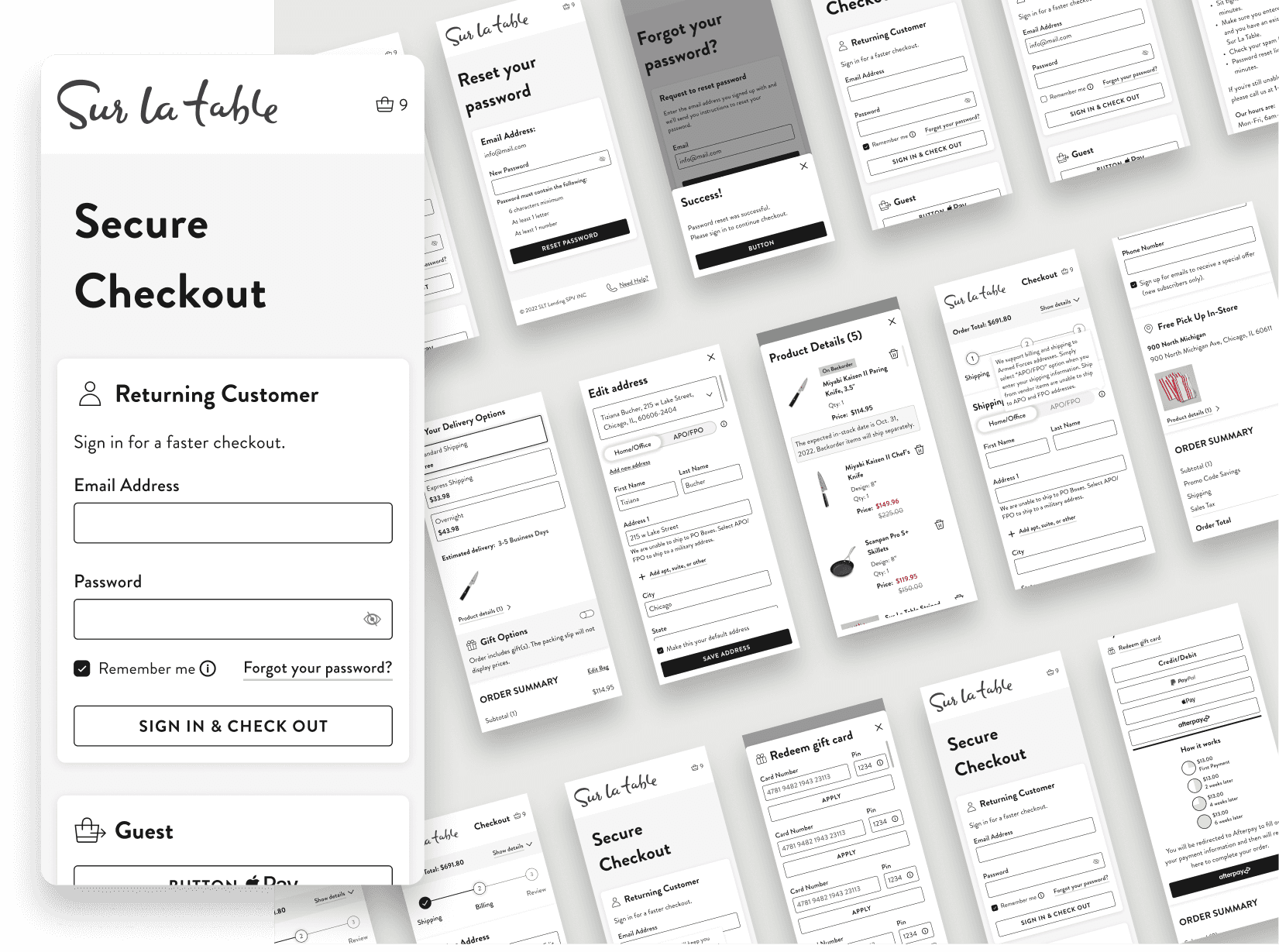
I began with low-fidelity wireframes in order to explore ideas more efficiently, enabling swift ideation, decision-making, and redesigning across various breakpoints. Upon receiving approval from my project manager, I refined them into high-fidelity mockups, creating new components for our design system to ensure consistency and enhance efficiency.
I began with low-fidelity wireframes in order to explore ideas more efficiently, enabling swift ideation, decision-making, and redesigning across various breakpoints. Upon receiving approval from my project manager, I refined them into high-fidelity mockups, creating new components for our design system to ensure consistency and enhance efficiency.

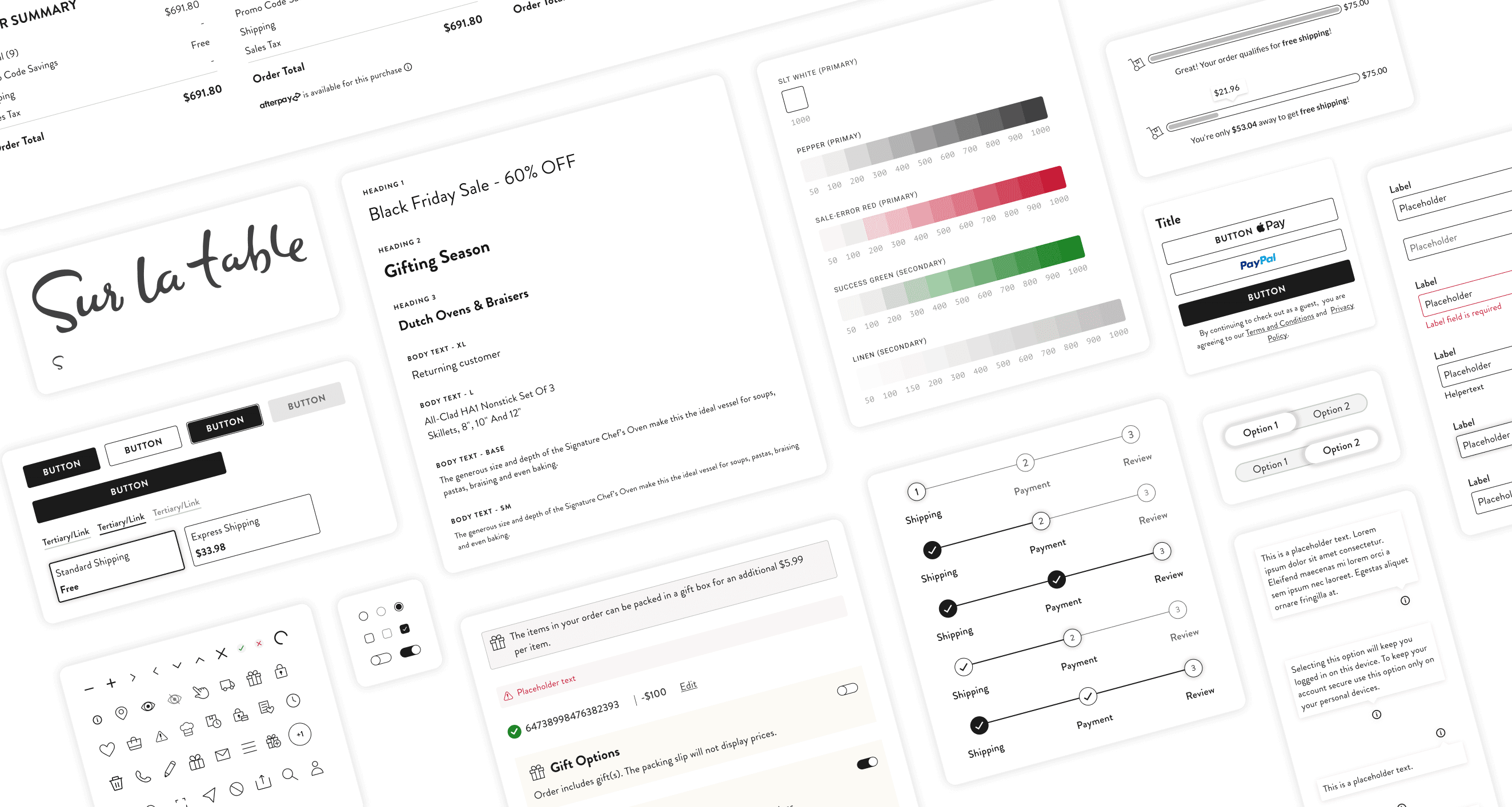
Design System
Design System
As the lead designer, it was my responsibility to design and build new components while continuously updating the design system.
As the lead designer, it was my responsibility to design and build new components while continuously updating the design system.
As the lead designer, it was my responsibility to design and build new components while continuously updating the design system.
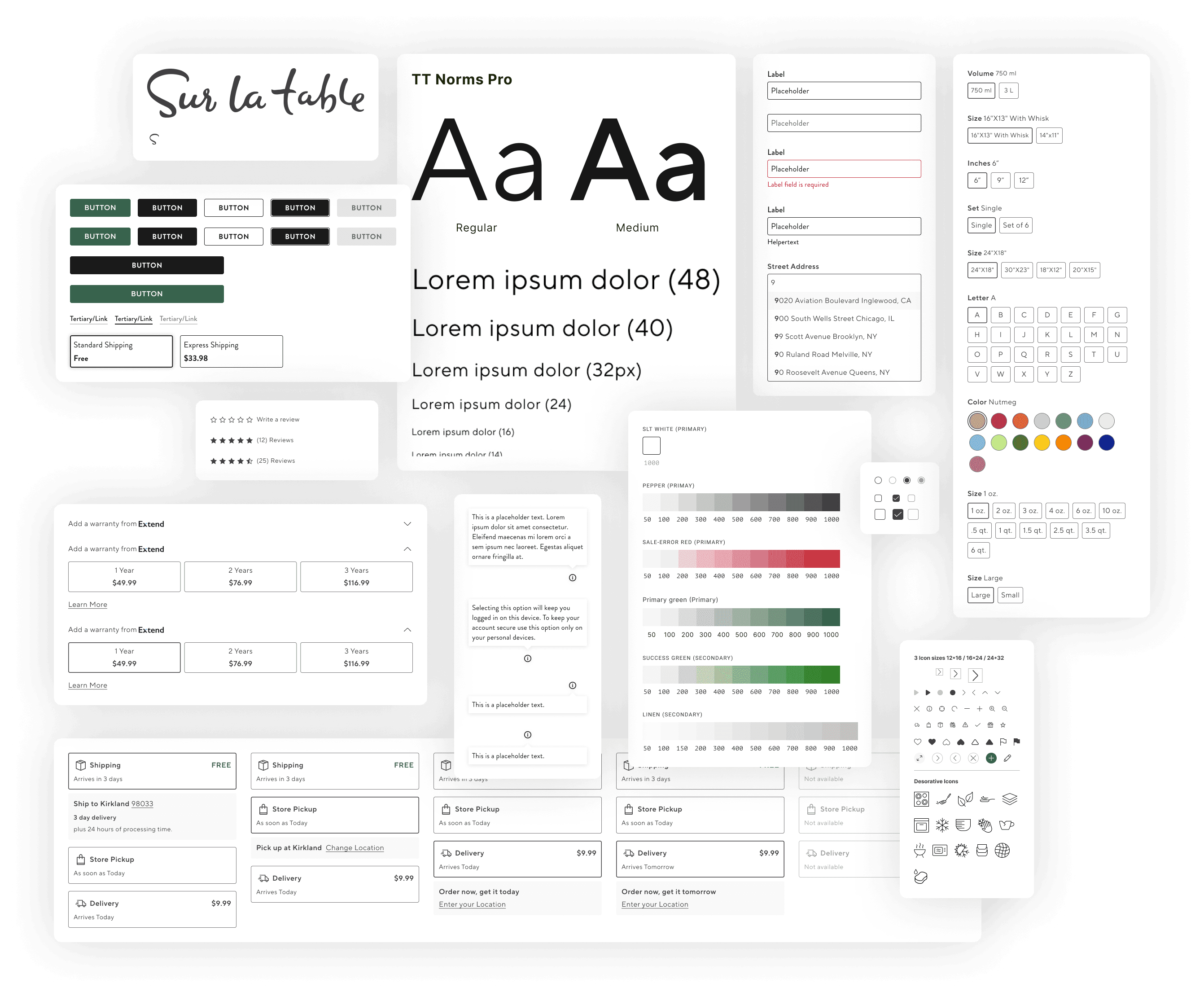
Font
Font
Font
Font
TT Norms Pro
Regular
Medium
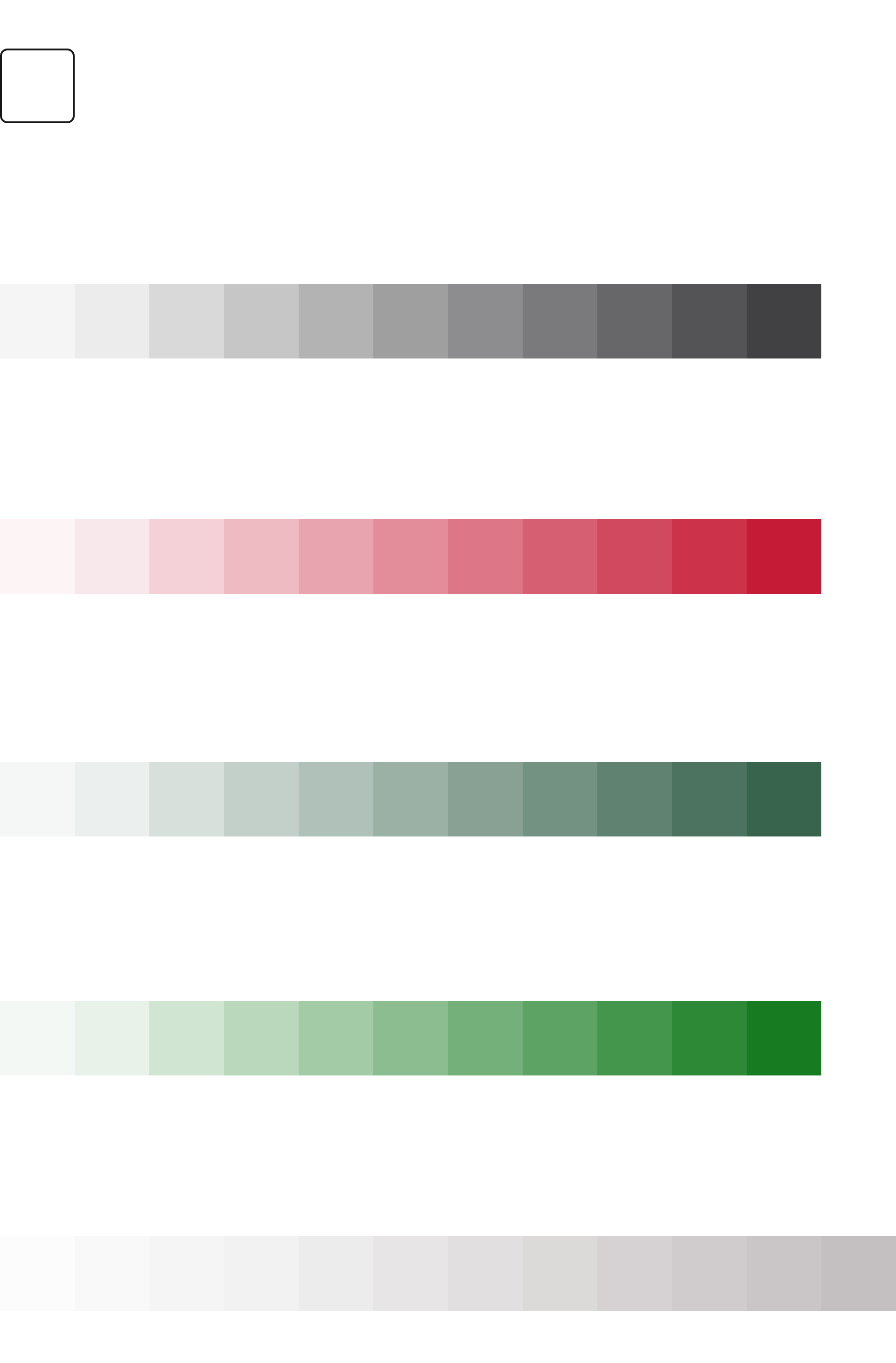
Color
Color
The client’s current PDP design is mainly black, white, and red for sales. To add more vibrancy, we updated the design guide with a new primary brand color. After collaborating with the marketing team, a dark, vibrant green was chosen. This color reflects the freshness and richness of food, thus aligning perfectly with the goal to focus on kitchen appliances and cooking classes.
The client’s current PDP design is mainly black, white, and red for sales. To add more vibrancy, we updated the design guide with a new primary brand color. After collaborating with the marketing team, a dark, vibrant green was chosen. This color reflects the freshness and richness of food, thus aligning perfectly with the goal to focus on kitchen appliances and cooking classes.

Page Sections
Page Sections

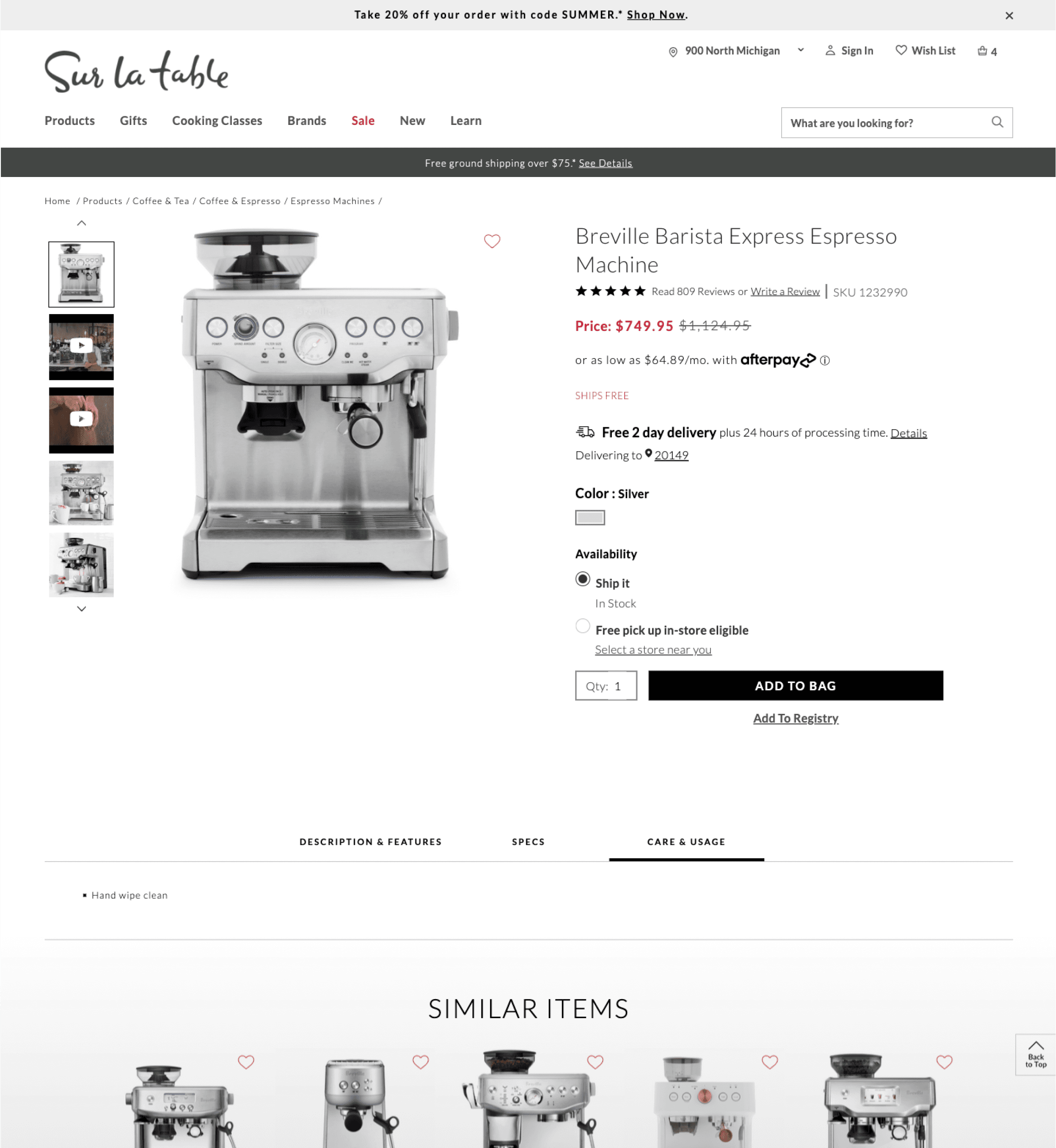
Photo Gallery - Widget
My team and I chose to display the images and videos in a larger two-column layout, with Chef-recommended videos appearing in 9:16 format. Each asset features a zoom icon, and clicking on said icon triggers a popup with a zoom function for enhanced viewing.
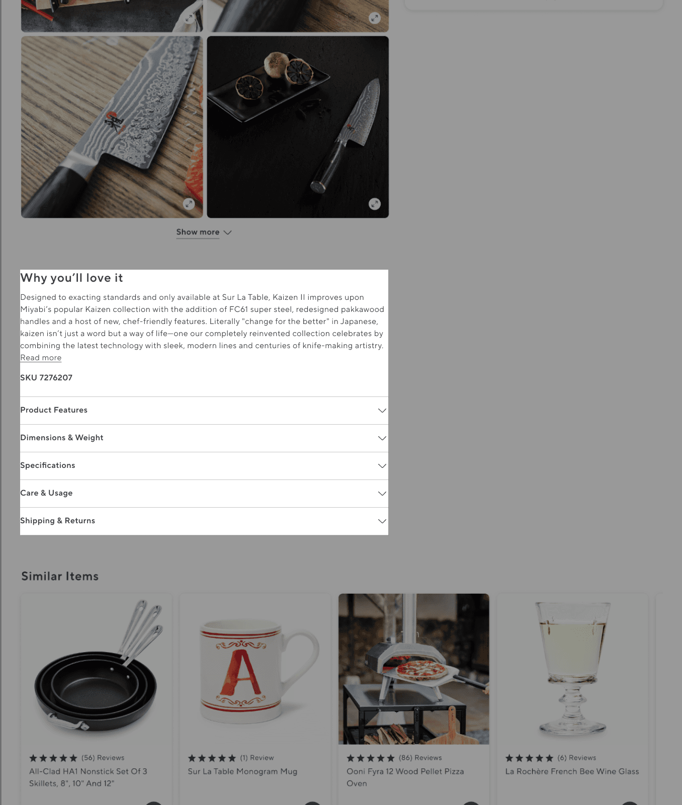
Product Description and Accordions
The storytelling widget is designed to guide users towards making informed decisions, dive deeper into product insights and specifications, and discover why a certain kitchen item is essential and belongs in their home.

Buy Box - Widget
This widget adapts to the product page and displays pricing, options, delivery, and warranties. It scrolls with users, enhancing user experience and simplifying the shopping process.
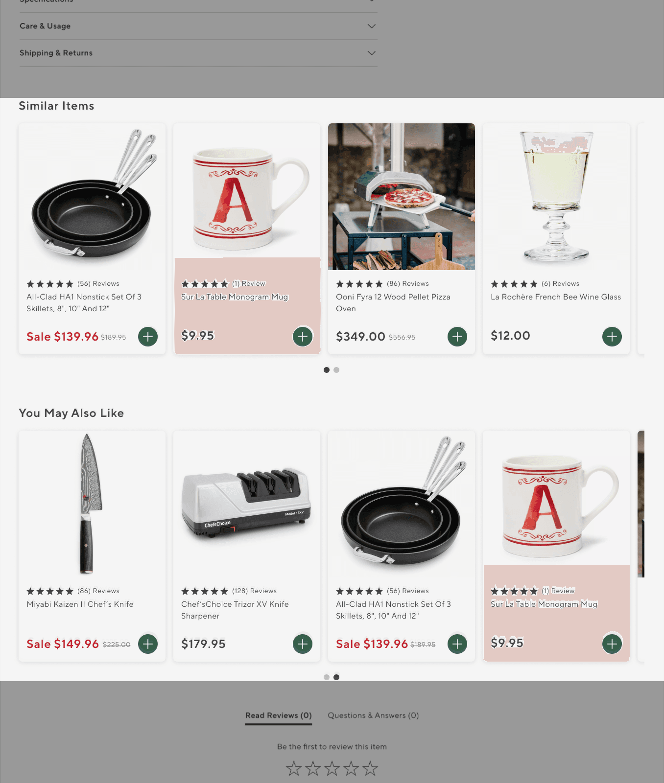
Recommendation Widget
All product pages feature two rows of recommended items. Users can quickly add products to their bag with a green CTA. Clicking any item card leads to the product’s detailed page for more information.
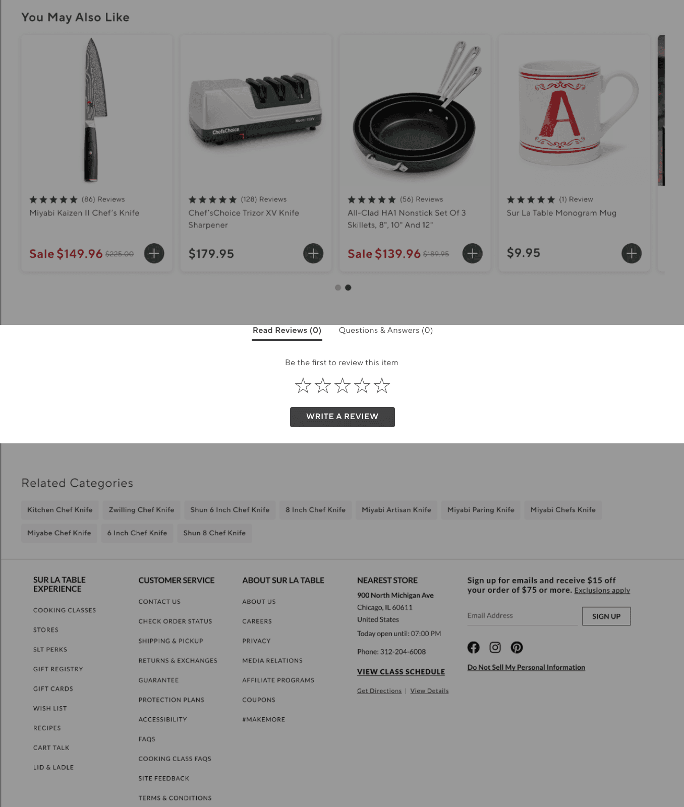
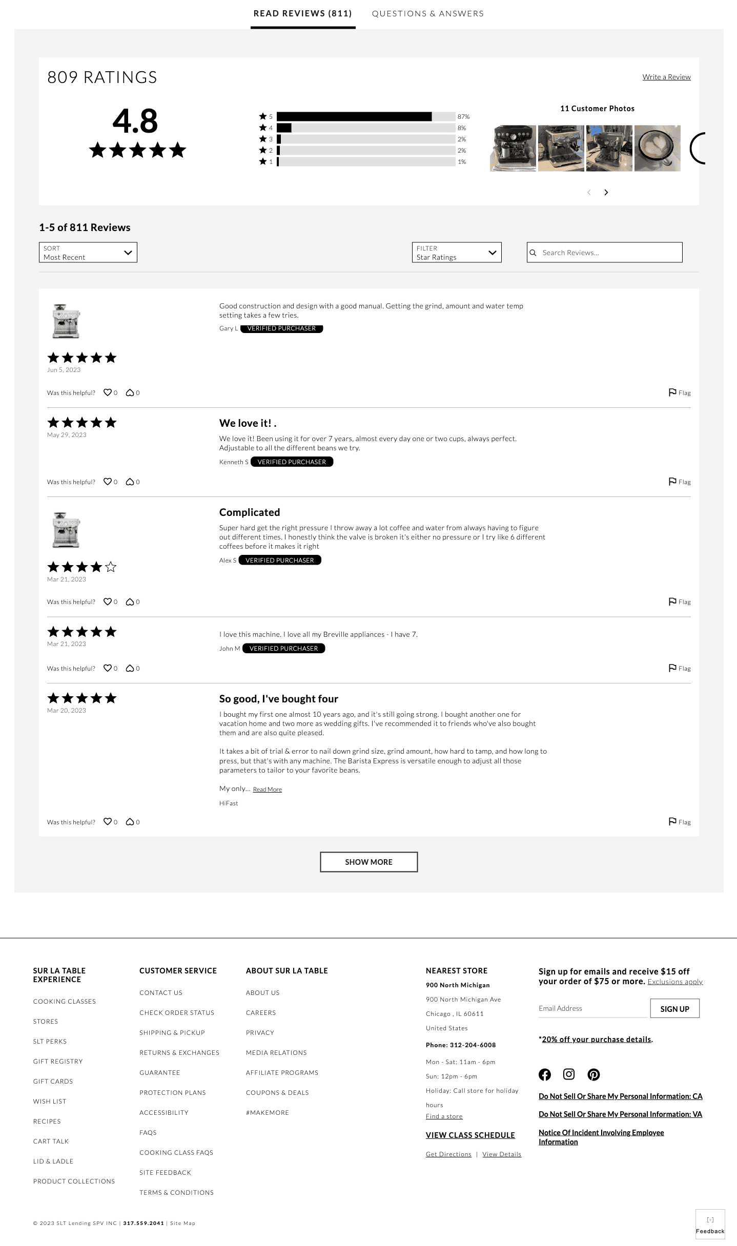
TurnTo Ratings Widget
TurnTo is the third-party platform used for ratings and Q&A. It supports multiple states: no ratings, ratings, ratings with comments, no Q&A, and Q&A.

Related Categories Tags
These tags help users navigate the site more easily by providing quick links to related categories. It offers a more convenient way to explore similar options without having to backtrack or perform a new search.
Photo Gallery - Widget
My team and I chose to display the images and videos in a larger two-column layout, with Chef-recommended videos appearing in 9:16 format. Each asset features a zoom icon, and clicking on said icon triggers a popup with a zoom function for enhanced viewing.
Product Description and Accordions
The storytelling widget is designed to guide users towards making informed decisions, dive deeper into product insights and specifications, and discover why a certain kitchen item is essential and belongs in their home.
Buy Box - Widget
This widget adapts to the product page and displays pricing, options, delivery, and warranties. It scrolls with users, enhancing user experience and simplifying the shopping process.
Recommendation Widget
All product pages feature two rows of recommended items. Users can quickly add products to their bag with a green CTA. Clicking any item card leads to the product’s detailed page for more information.
TurnTo Ratings Widget
TurnTo is the third-party platform used for ratings and Q&A. It supports multiple states: no ratings, ratings, ratings with comments, no Q&A, and Q&A.
Related Categories Tags
These tags help users navigate the site more easily by providing quick links to related categories. It offers a more convenient way to explore similar options without having to backtrack or perform a new search.
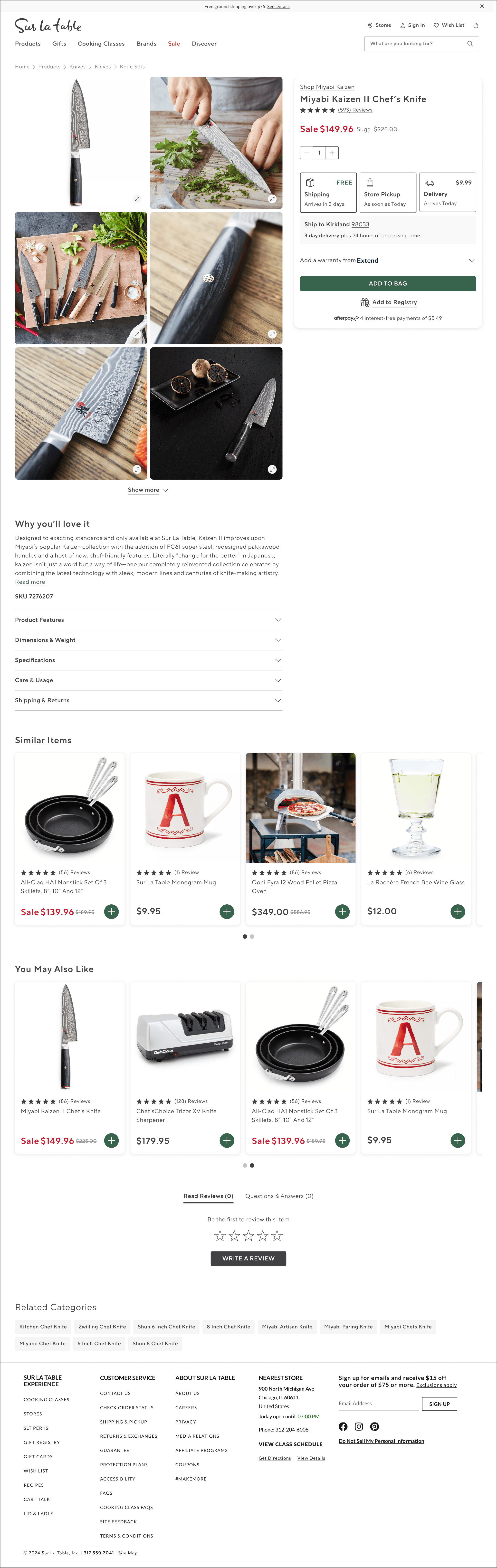
In this carousel you will see the different widgets of the page
In this carousel you will see the different widgets/sections of the page
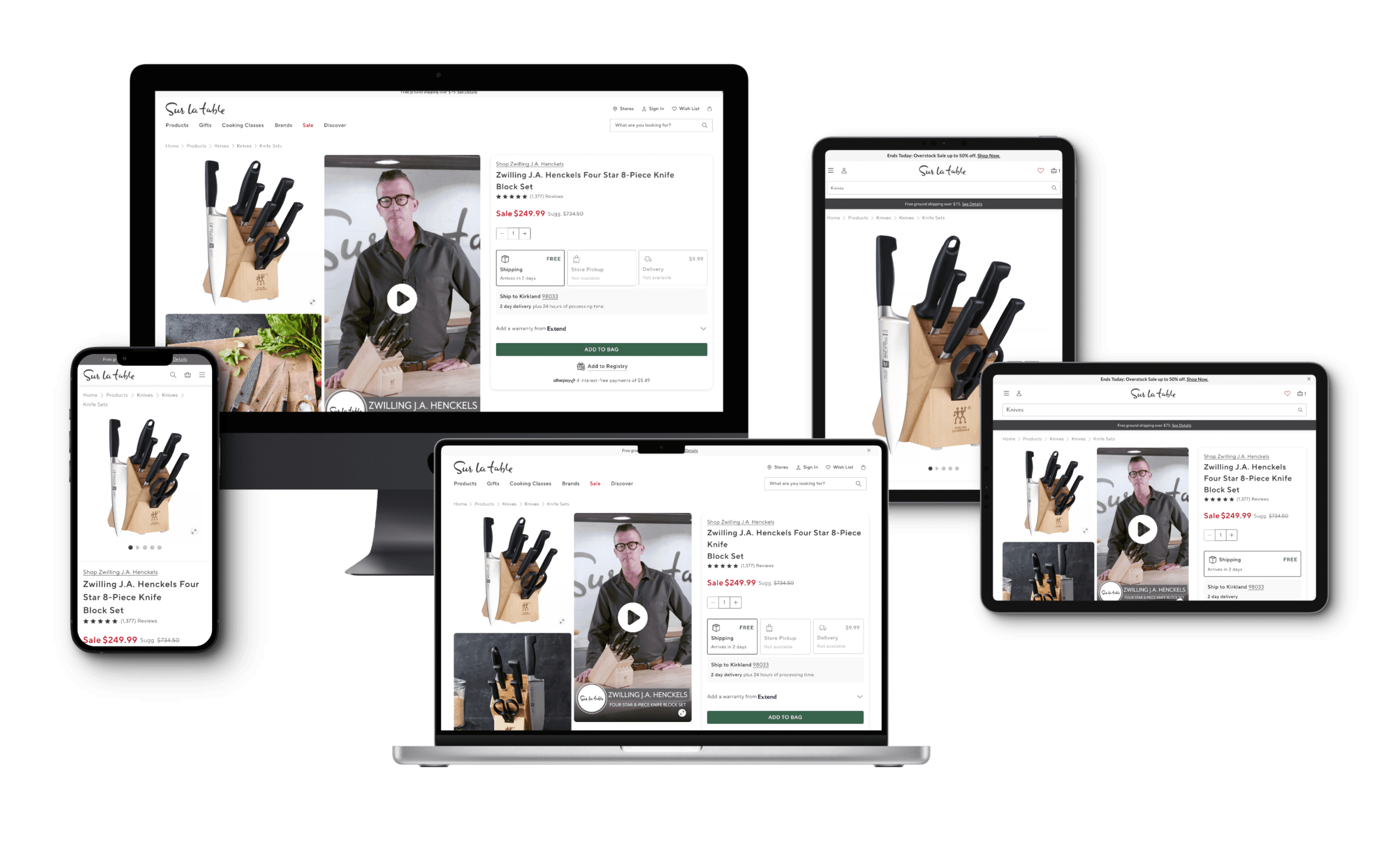
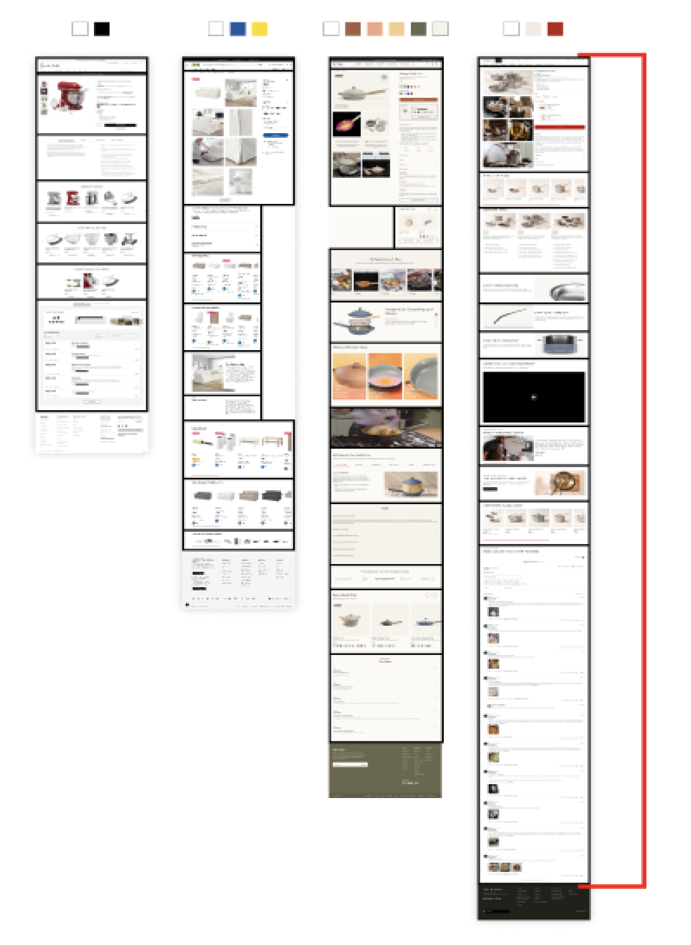
Designs for 5 Breakpoints
Responsive
By ensuring our website is responsive, we enhance the user experience. We have 5 breakpoints. I design the experience to adapt to all device sizes, the goal is to boost accessibility, and amplify engagement for greater success.
Component build
Once I finalized the overall design, I created various scenarios to help our stakeholders and development team visualize the concepts more effectively. To improve efficiency, I built components with multiple variables. This allowed for quick updates across all five breakpoints, ensuring the correct information was consistently applied.
Video of Component with its variables
Designs for 5 Breakpoints
Responsive
Responsive
By ensuring our website is responsive, we enhance the user experience. We have 5 breakpoints. I design the experience to adapt to all device sizes, the goal is to boost accessibility, and amplify engagement for greater success.
By ensuring our website is responsive, we enhance the user experience. We have 5 breakpoints. I design the experience to adapt to all device sizes, the goal is to boost accessibility, and amplify engagement for greater success.
Component build
Component build
Once I finalized the overall design, I created various scenarios to help our stakeholders and development team visualize the concepts more effectively. To improve efficiency, I built components with multiple variables. This allowed for quick updates across all five breakpoints, ensuring the correct information was consistently applied.
Once I finalized the overall design, I created various scenarios to help our stakeholders and development team visualize the concepts more effectively. To improve efficiency, I built components with multiple variables. This allowed for quick updates across all five breakpoints, ensuring the correct information was consistently applied.
Video of Component with its variables

Designs for Five Breakpoints
Responsive Design
We were able to enhance the user experience by ensuring the client’s website is responsive. There were a total of five breakpoints. I designed the experience to adapt to all device sizes, and the goal was to boost accessibility and amplify engagement.
Responsive Design
We were able to enhance the user experience by ensuring the client’s website is responsive. There were a total of five breakpoints. I designed the experience to adapt to all device sizes, and the goal was to boost accessibility and amplify engagement.
Designs for Five Breakpoints
FINAL RESULT
FINAL RESULT
Walk through
Walk-Through
Walk through
We integrated decision-making tools with engaging text and visuals, empowering users to make informed and confident purchasing choices. This approach enhances visual appeal, boosts user engagement, and improves both exposure and SEO.
The redesign is not solely focused on driving sales but also on educating users about the product, striking a balance with 70% sales-driven content and 30% educational content.
My team and I integrated decision-making tools with engaging text and visuals, empowering users to make informed and confident purchasing choices. This approach enhances visual appeal, boosts user engagement, and improves both exposure and SEO.
The redesign is not solely focused on driving sales but also on educating users about the product, striking a balance with 70% sales-driven content and 30% educational content.
We integrated decision-making tools with engaging text and visuals, empowering users to make informed and confident purchasing choices. This approach enhances visual appeal, boosts user engagement, and improves both exposure and SEO.
The redesign is not solely focused on driving sales but also on educating users about the product, striking a balance with 70% sales-driven content and 30% educational content.
Mobile Walkthrough (click to play)
Mobile: Mobile Walk-Through (click to play)
Mobile Walkthrough (tap to play)
Mobile Walkthrough (tap to play)
Mobile Walkthrough (tap to play)
Desktop Walkthrough (click to play)
Desktop: Mobile Walk-Through (click to play)
Desktop Walkthrough (tap to play)
Desktop Walkthrough (tap to play)
Desktop Walkthrough (tap to play)
Facts
Facts:
Facts
Checkout the Product page live on www.surlatable.com
Checkout the Product page live on www.surlatable.com
Tools:
Tools:
Facts:
Facts:
5 Breakpoints
5 Breakpoints
+3% Conversion Lift
223 Frames (in Figma)
35+ Components Built for Design System
5 Breakpoints
+3% Conversion lift
+3% Conversion lift
223 Frames (in Figma)
223 Frames (in Figma)
35+ components build for Design system
35+ components build for Design system
Takeaway
Takeaway
Redesigning the product details page highlighted how even small improvements in product information can greatly enhance user experience. I also became more efficient at building complex components, making it easier for product managers to update my mockups if needed.
Redesigning the product details page highlighted how even small improvements in product information can greatly enhance the user experience. I also became more efficient at building complex components, making it easier for product managers to update my mockups if needed.
Redesigning the product details page highlighted how even small improvements in product information can greatly enhance user experience. I also became more efficient at building complex components, making it easier for product managers to update my mockups if needed.
See More Case Studies
See More Case Studies
See More Case Studies
See More Case Studies
See More Case Studies
Thanks For Watching

© Tiziana Bucher 2025. All Rights Reserved
Thanks For Watching
© Tiziana Bucher 2025. All Rights Reserved
Thanks For Watching
© Tiziana Bucher 2025. All Rights Reserved
Thanks For Watching
© Tiziana Bucher 2025. All Rights Reserved